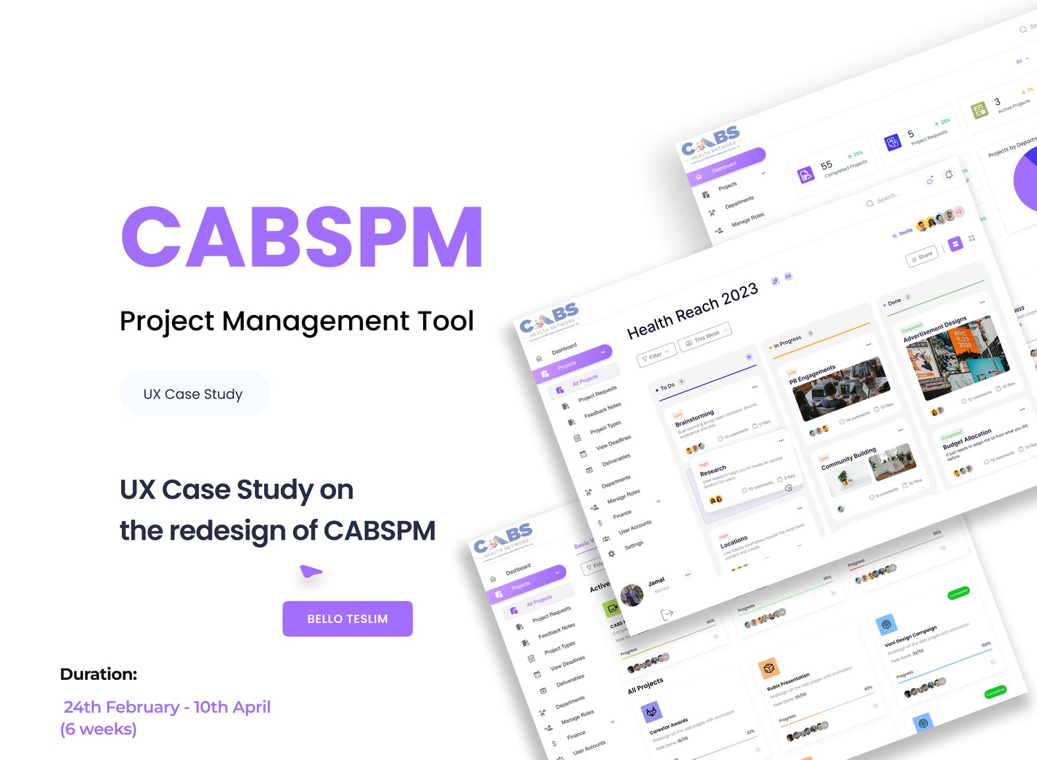
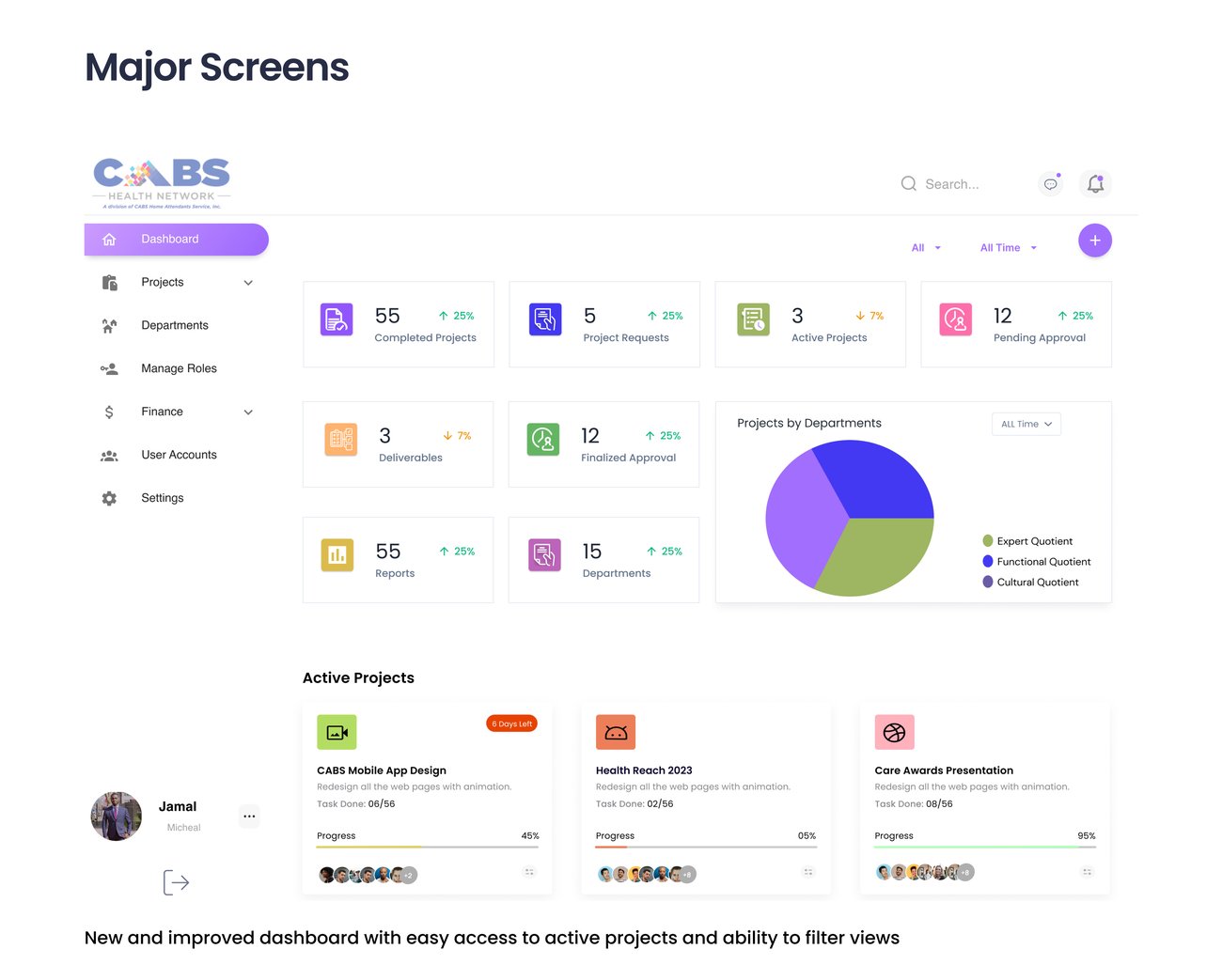
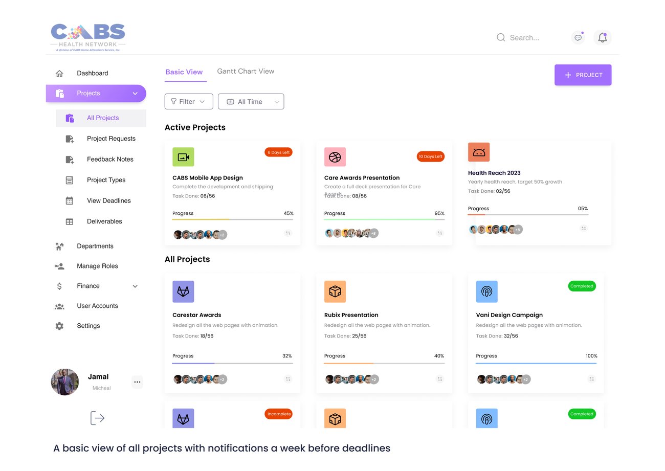
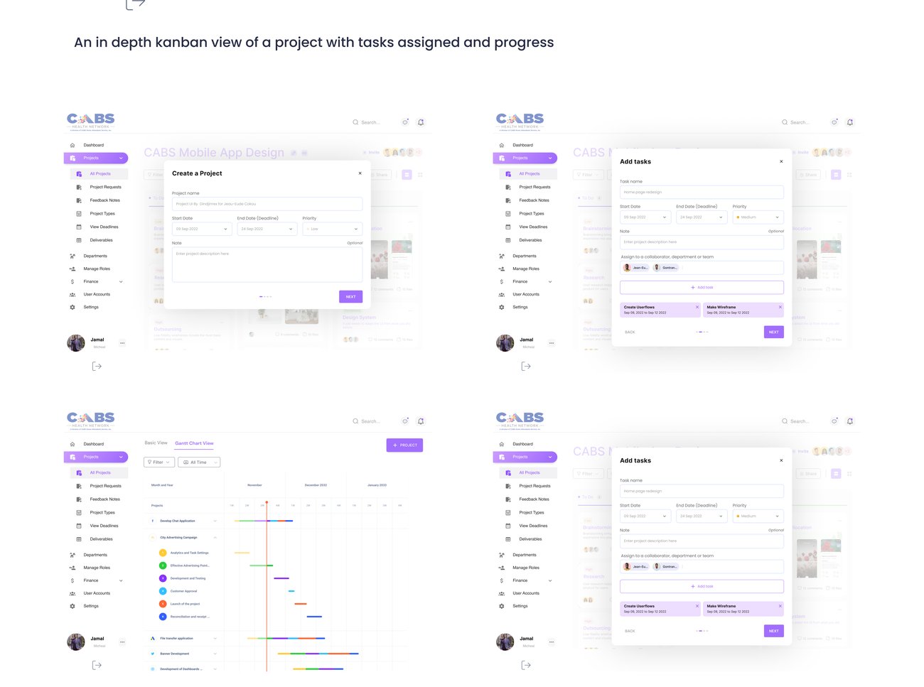
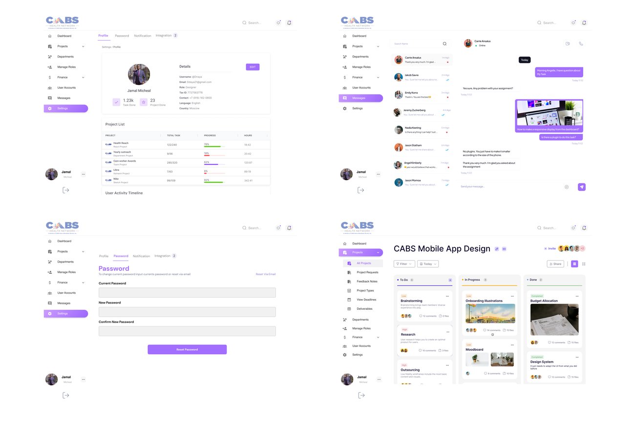
Our client, a healthcare agency, had run our in-house project-management tool for years, capable, but cluttered and hard to use, with adoption slipping. As lead designer I rebuilt CABSPM end to end: research, IA, task flows, and a full high-fidelity redesign across the entire tool.
Lead UI/UX designer on an end-to-end redesign of a care agency's dense internal tool: full UX audit, research with real users, then every core screen rebuilt in six weeks. Everything below is the actual delivered work. Skim the screens first if you're short on time.
Our client, a healthcare agency, had used CABS Project Management for years to run their projects. It already did a lot:
But the feedback was consistent: the tool wasn't user-friendly and was difficult to use. As the UI/UX designer, I was asked to redesign it, making it intuitive and user-friendly without losing the depth teams relied on.
Before a single screen, the real risks were organisational, getting people to actually switch.
Team members and stakeholders were comfortable with the old way of working, however clunky.
Even with better design and functionality, getting people to actually adopt the redesigned tool would be a challenge.
Success depended on buy-in from upper management, team members, and end-users alike.
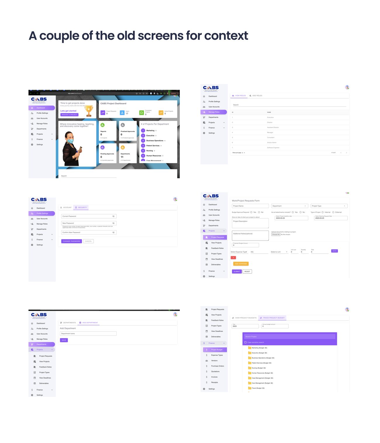
To begin, I reviewed the existing tool end to end and identified the issues dragging the experience down.
The interface overwhelmed users, too much on screen, too little hierarchy.
Language was inconsistent throughout the tool, so users couldn't build a reliable mental model.
Completing a task took more steps than it should, the flow fought the user.
There was no at-a-glance view of a project's status or progress.
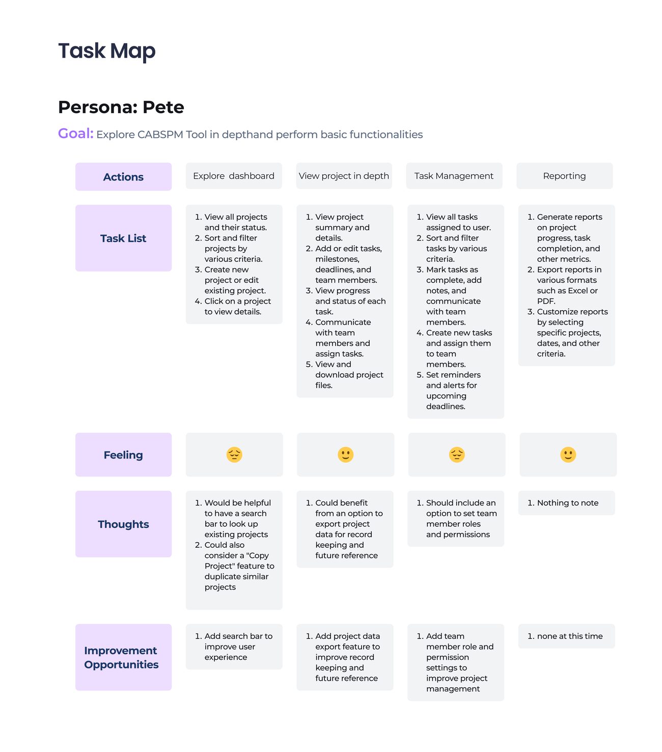
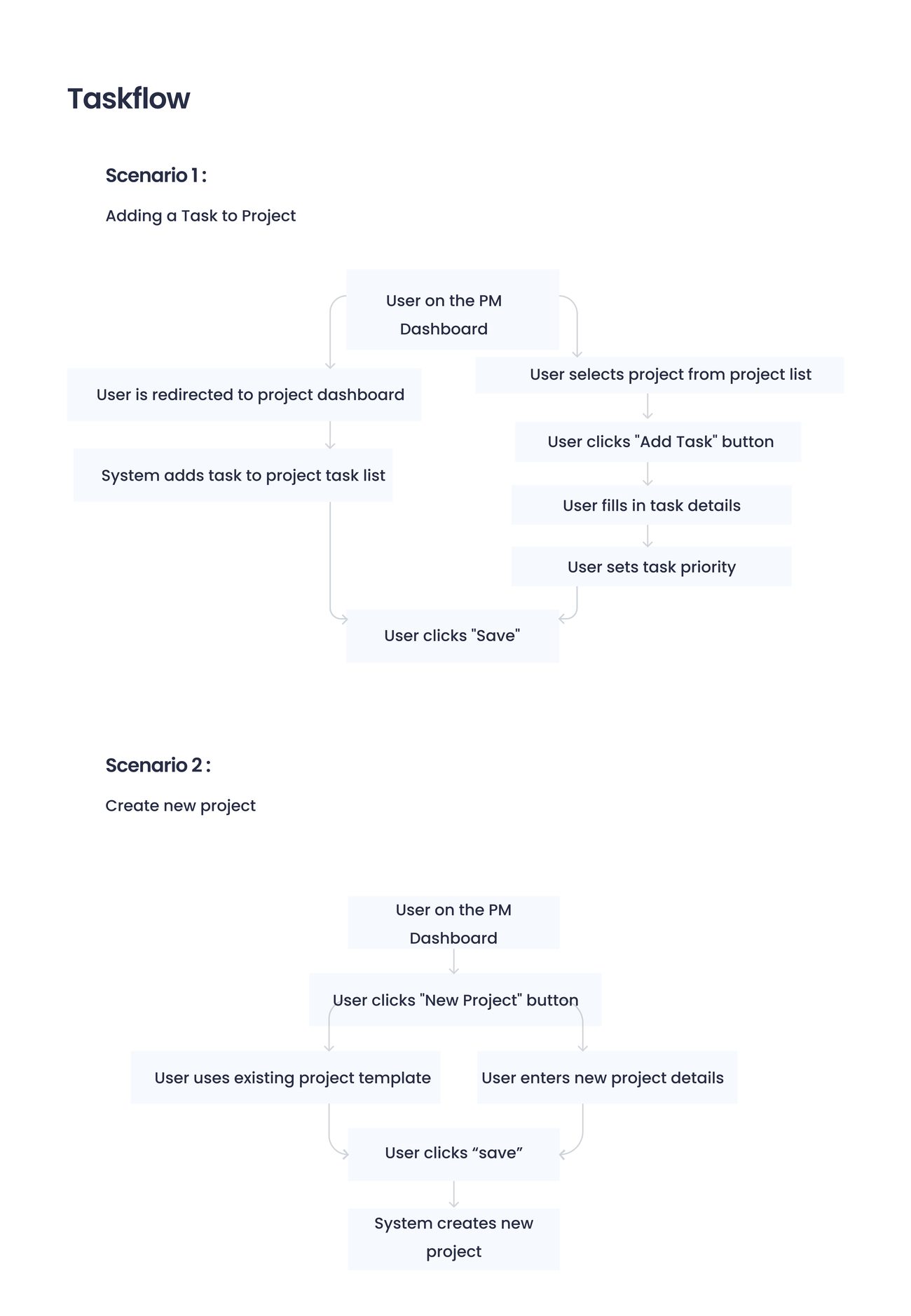
I mapped the core scenarios the redesign had to make effortless.
To understand the needs and pain points, I surveyed current CABS PM users and spoke with project managers and team leads to pinpoint the most significant usability issues. The recurring theme: the tool was hard to navigate, unintuitive, and made tracking progress and project status difficult.
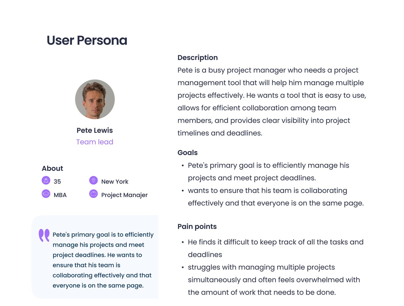
The redesigned tool serves project managers, supervisors, managers, executives, staff, and team leads. Two primary personas anchored the work.
A busy PM who needs to quickly create projects and tasks, assign team members, and track progress, without fighting the interface.
A team lead who needs a clear overview of project status and progress, and a simple way to communicate with her team.

Make the tool more intuitive and easier to use, so work moves faster.
Simplify the interface so new users get productive quickly.
Add features that promote teamwork and communication across the team.
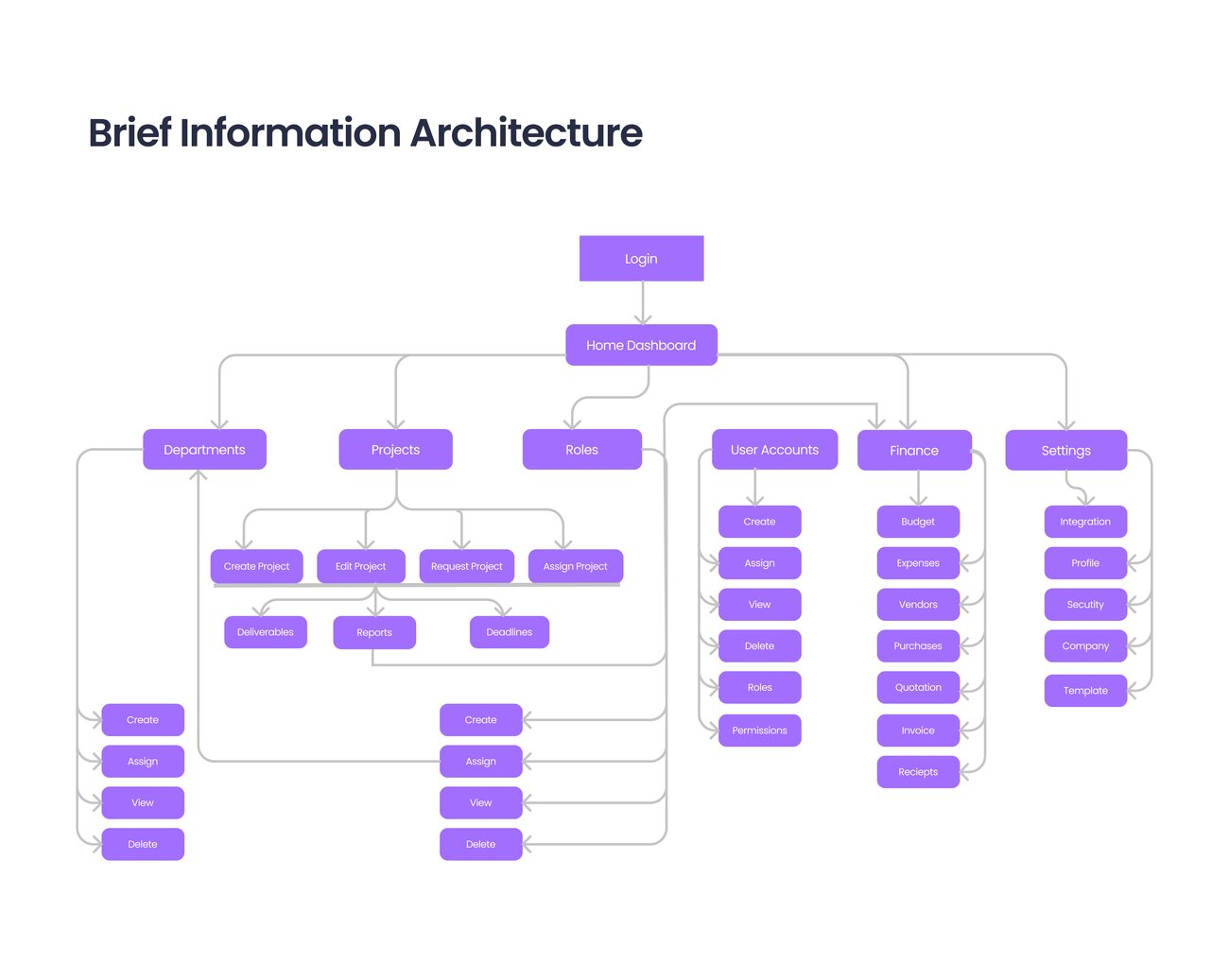
Information architecture, task mapping, task flows, and sketches, the scaffolding that made the redesign navigable and simple.


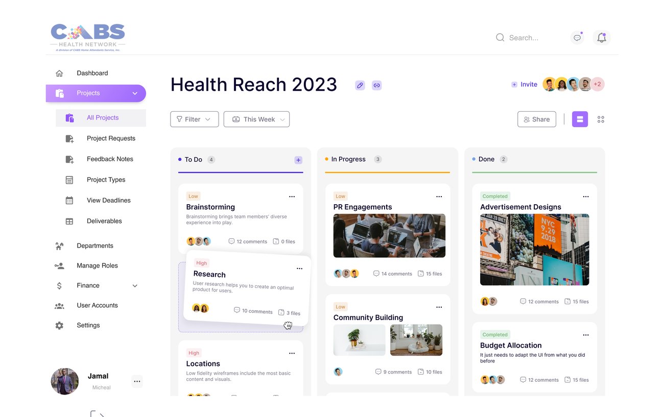
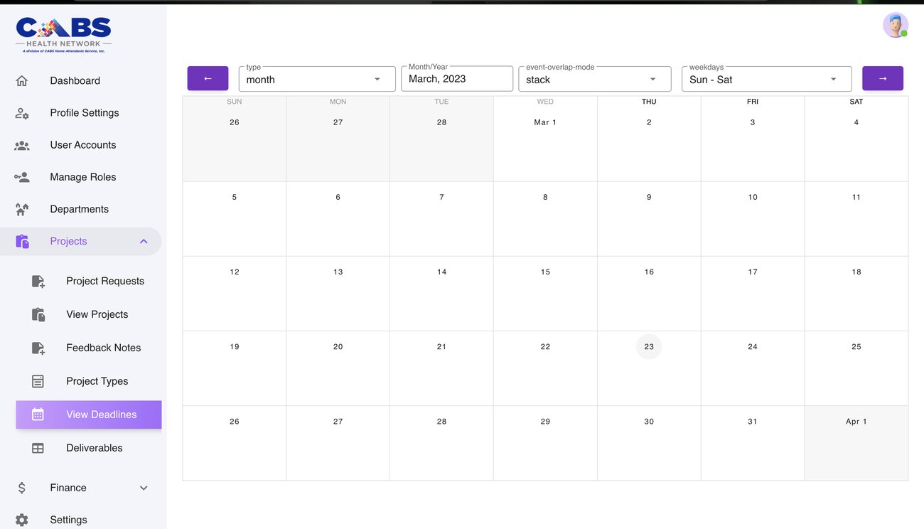
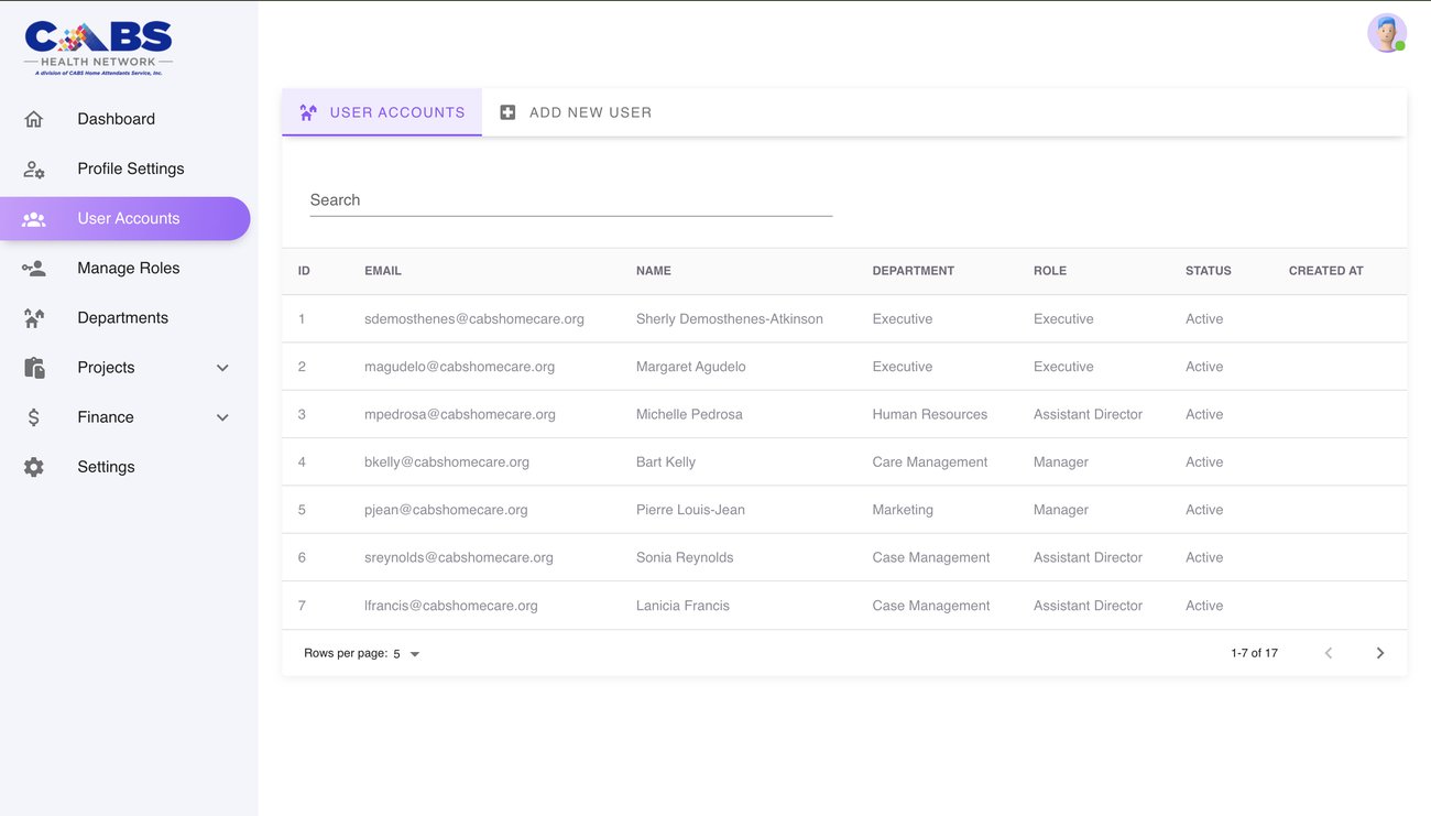
A clean, scannable system, a dashboard you can read at a glance, project boards, and detail views that surface the right thing at the right moment.


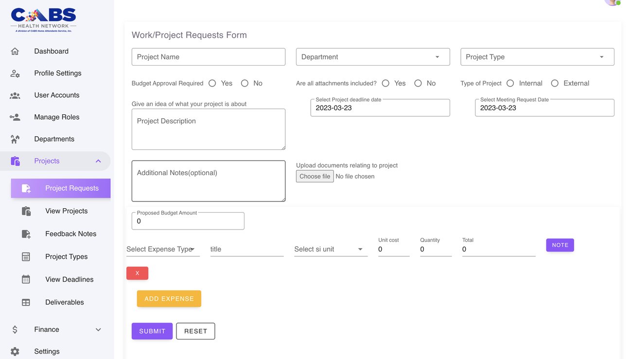
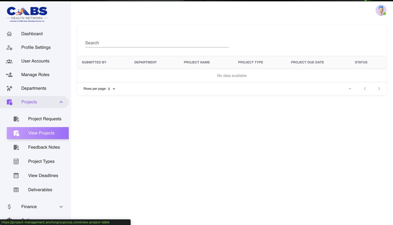
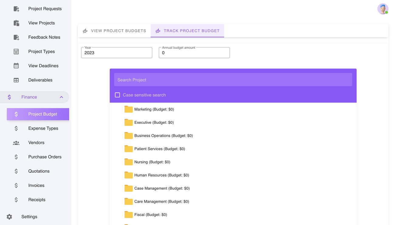
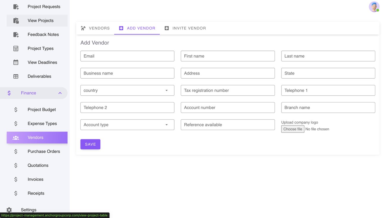
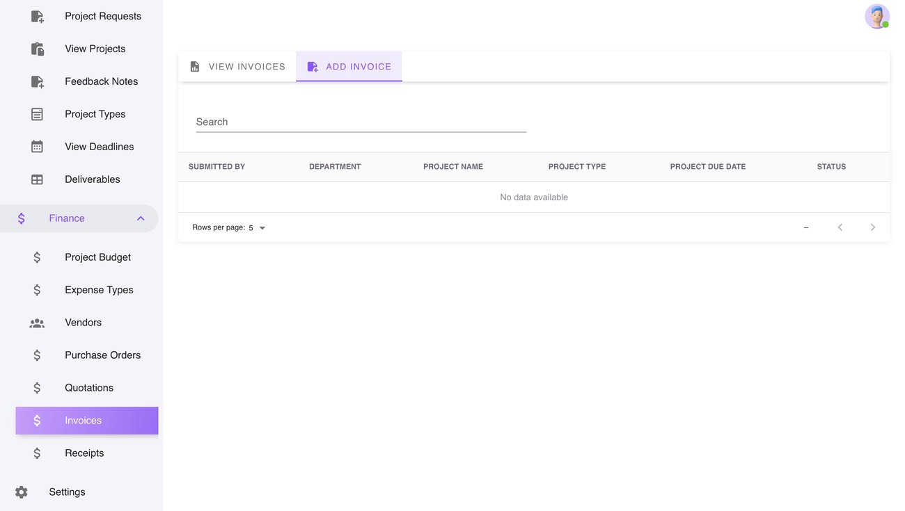
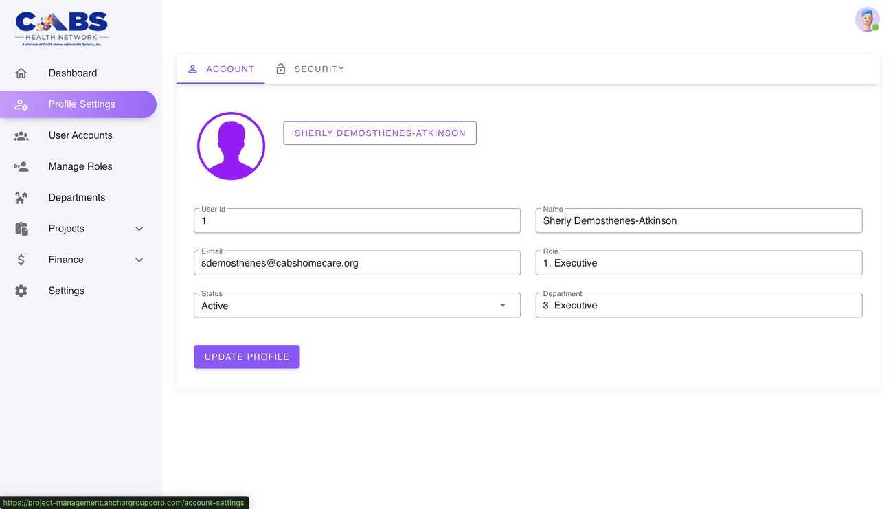
This wasn't a one-screen refresh. Every surface was rebuilt, from sign-in and user accounts to requests, budgets, vendors, and reporting.


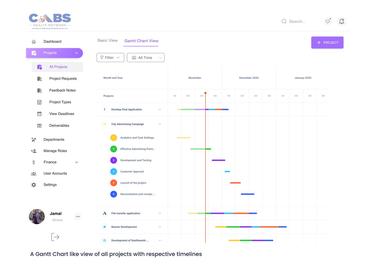
A new Gantt-style project view exposes timelines, deadlines, and dependencies, so bottlenecks surface early.
Seamless hooks into Slack, Google Calendar, email, and document management, meeting teams where they already work.
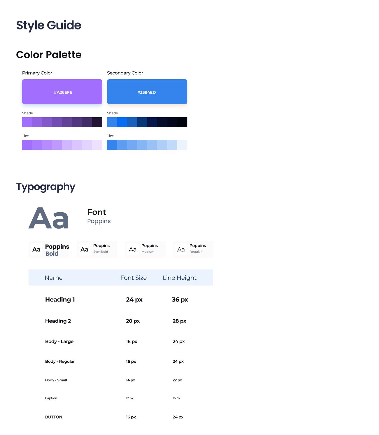
Clear, intuitive design elements that are easy to navigate, the whole point of the brief.
Assign tasks, set deadlines, and track progress with far less friction, plus easy collaboration.
Reusable project templates to spin up new projects and workflows in seconds.
A bold add, messaging inside the tool. Shipped as a test run, to validate against teams used to email before fully committing.

The redesign addressed the usability issues of the old tool and gave teams a more intuitive, user-friendly experience, grounded in research, surveys, and usability testing, with an emphasis on simplicity and efficiency across project & task management, reporting, and collaboration.