View
Back to archive Project · Fintech · Crypto
Case study Mobile Brand Identity UX Research UI/UX

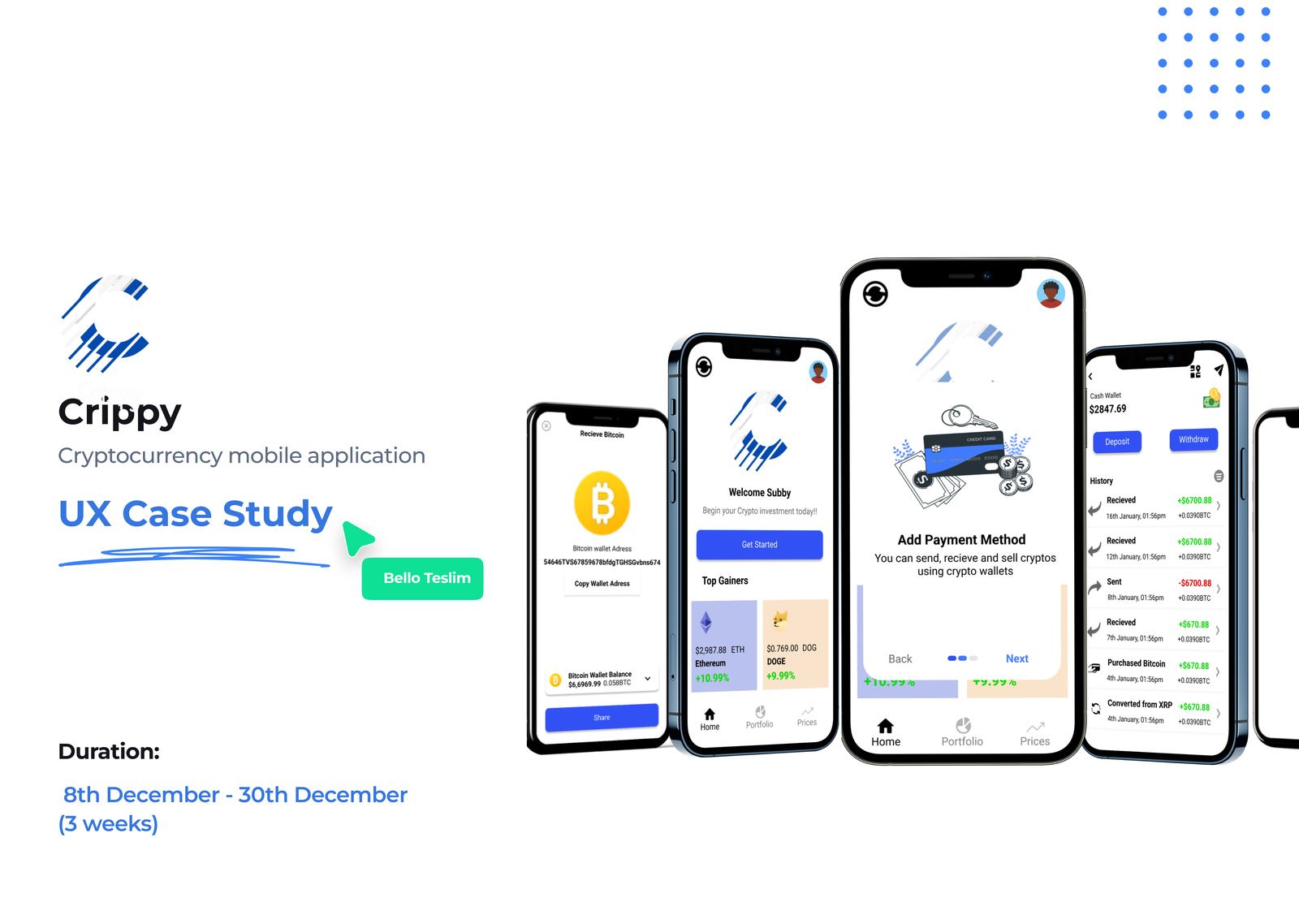
Crippy — crypto, minus the ambiguity.

A crypto mobile app built to make trading, sending, and receiving feel approachable rather than intimidating, eliminating the ambiguity of the cryptosphere so anyone, expert or first-timer, can act with confidence.
RoleBrand · UX Research · UI/UX
Year2022
PlatformiOS · mobile
ScopeResearch · UI · prototyping
Crippy, crypto mobile app
Prefer the deep dive? This page is a quick walkthrough, the full case study (research, process & every screen) lives on Notion.Read the full case study →

Product overview

Crippy is an app designed to eliminate the ambiguity in the cryptosphere, letting users trade, transfer, or receive crypto across their wallets with ease, and making the everyday use of digital currency genuinely frictionless.

I dug into the usual trading patterns to find the screens and functionality that matter most, then used the newest trends in crypto and mobile interface design to keep it simple, elegant, and performant.

Responsibility

UI design · UX research · Prototyping

Tools

Figma · Miro · Canva · SurveyMonkey

01 · Problem & goals

Crypto is powerful — and intimidating.

After proper research, a few key stumbling blocks kept surfacing, and a clear set of goals to answer them.

The problem
  • For newcomers and even some pros, there are too many intricate features.
  • The onboarding procedure isn't very informative.
  • Account recovery is difficult.
  • Tracking portfolio profits and losses is hard.
  • Purchasing cryptocurrency is difficult.
The goals
  • Make crypto applications more accessible.
  • Enable transactions with little or no prior expertise.
  • Provide a seamless crypto experience.
  • Eliminate ambiguity so every transaction executes smoothly.
  • Add a news pattern to reduce reliance on external resources.
02 · Pain points

Where the frustration lives.

Analysing pain points surfaced what was really causing friction, and pointed directly at the functionality worth building.

01

Security fears

Users see fraudsters as a real threat, making them anxious about how to secure their investments.

02

Lack of transparency

Transactions feel opaque and not real-time, leaving users unsure of what's actually happening.

03

Steep learning curve

The terminology is hard to grasp, especially in the early days of using crypto.

04

First-payment hesitation

Users want to trade but feel unsure about making that initial payment.

Target audience

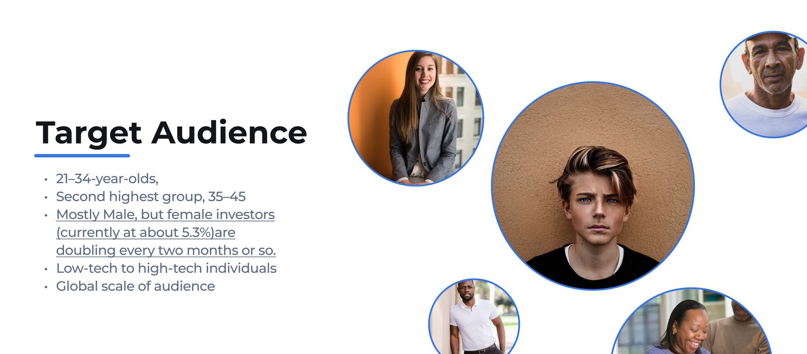
  • Primarily 21–34-year-olds, with a strong secondary group of 35–45.
  • Mostly male, but female investors (around 5.3%) are doubling every couple of months.
  • Spanning low-tech to high-tech individuals.
  • Global in scale.
Crippy target audience
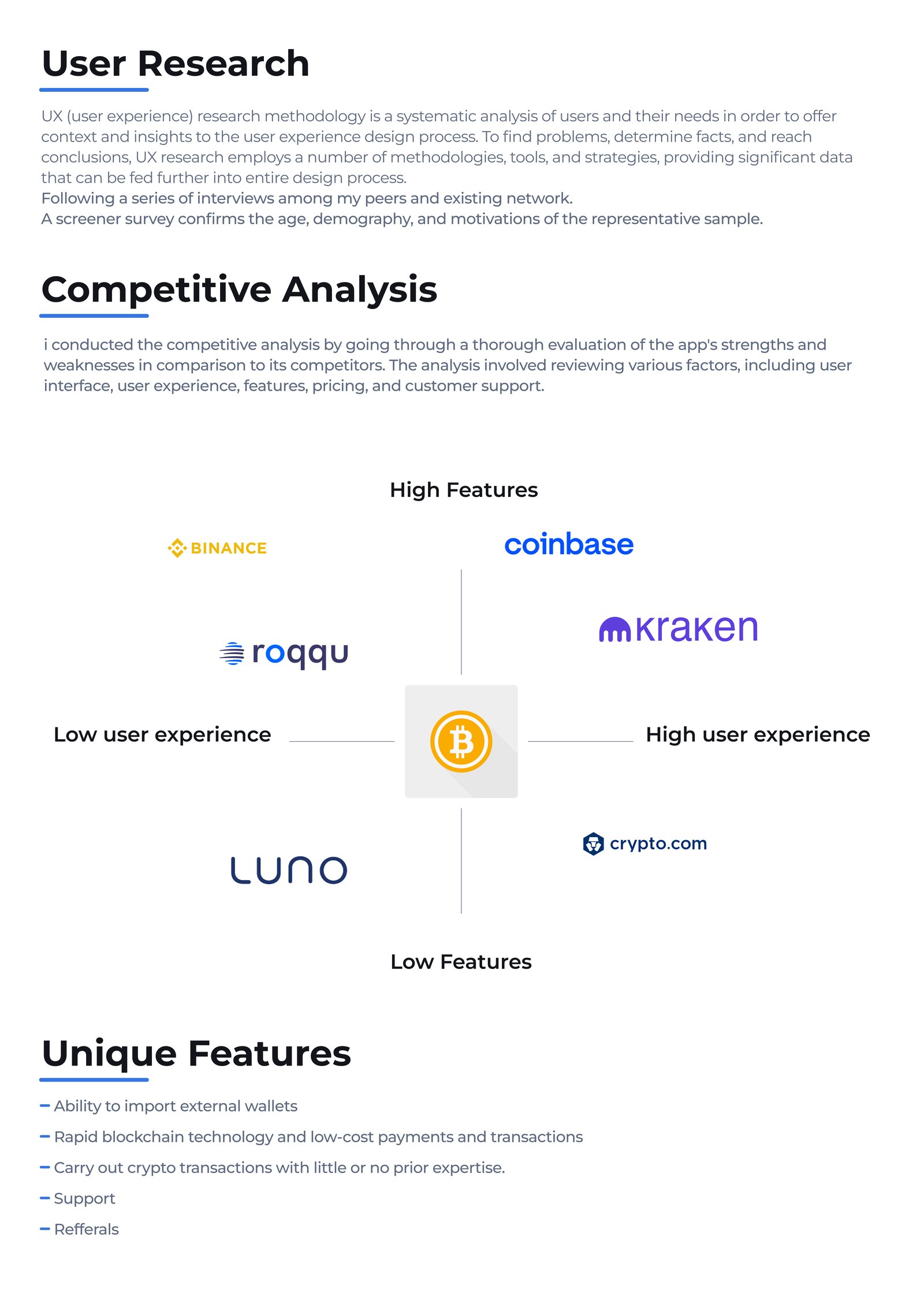
03 · User research

Listening before building.

Surveys and conversations across Reddit, Quora, and my own network, gathering the qualitative picture before chasing the numbers.

Crippy user research

↕ Scroll inside the frame to read the research

04 · Quantitative research

What the numbers said.

Multiple online surveys via Reddit, Quora, and my own network, more than 20 responses per question. A clear signal: crypto draws younger adults more than any other financial vertical.

60%found it difficult to manage a crypto wallet
70%feel secure using crypto apps
60%of crypto users are aged 18–35
40%have not used any crypto platform before
80%believe buying crypto is a tedious experience
50%of all crypto users are European
80%are familiar with what bitcoin is
70%think crypto is all about bitcoin alone
05 · Personas

Who we're designing for.

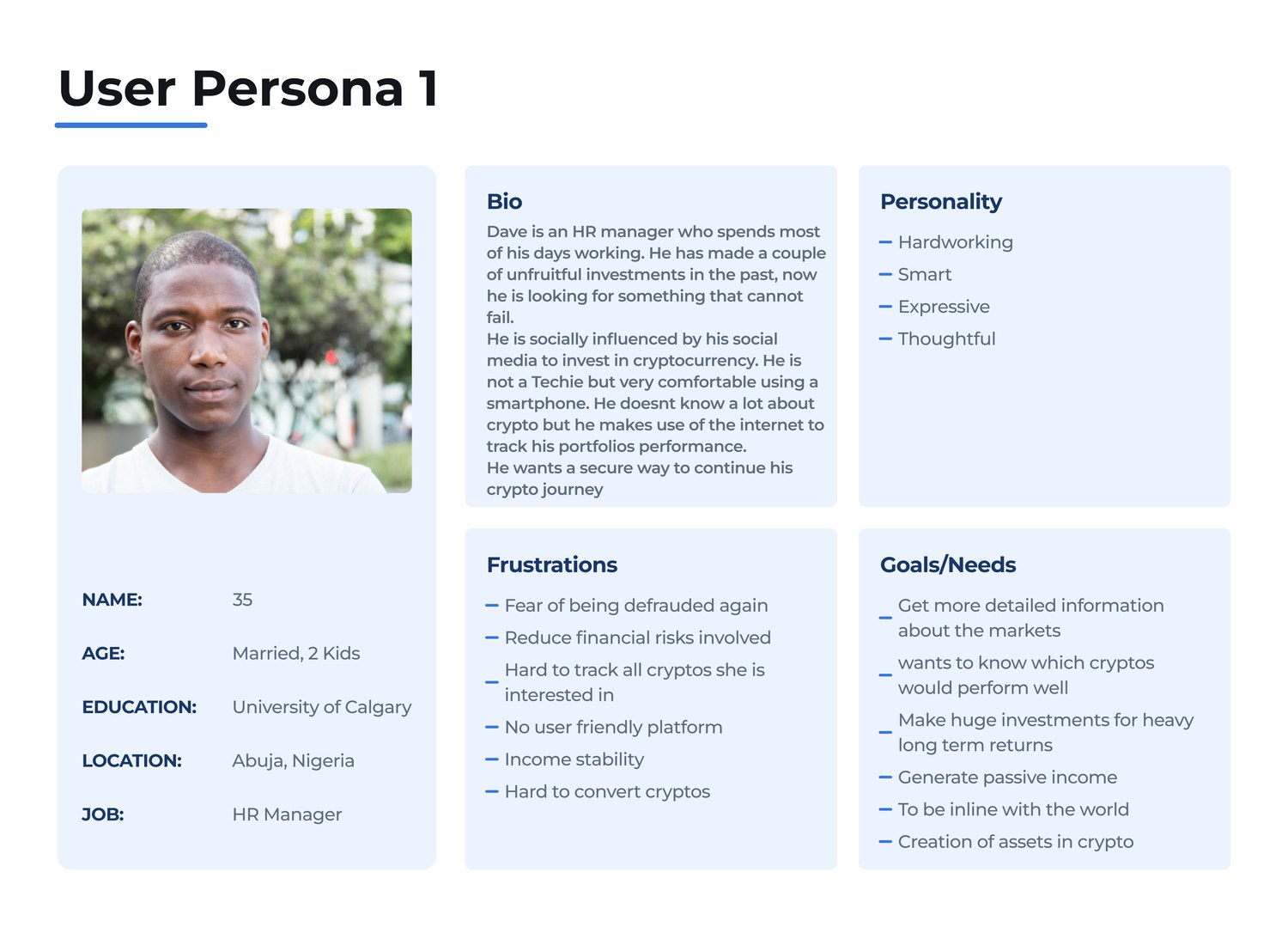
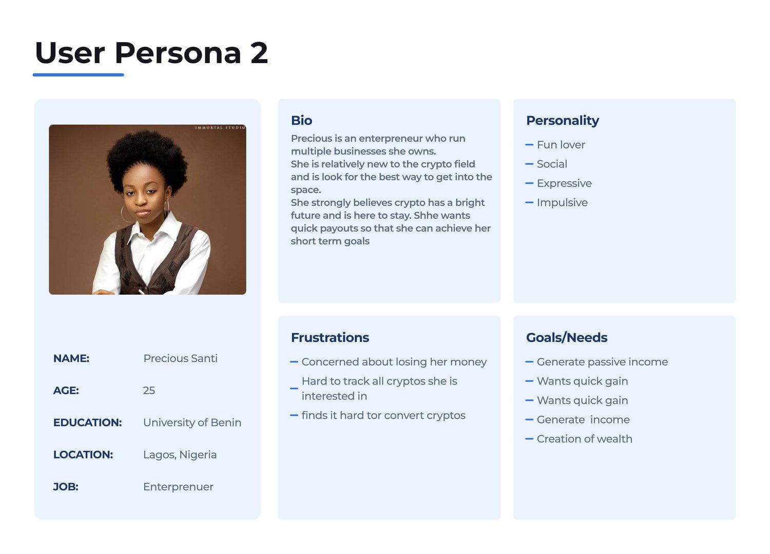
Two personas anchored the work, a cautious newcomer and an ambitious entrepreneur, each with their own goals, frustrations, and appetite for risk.

Crippy user persona 1
Crippy user persona 2, Precious Santi
06 · Empathy map

Says, thinks, does, feels.

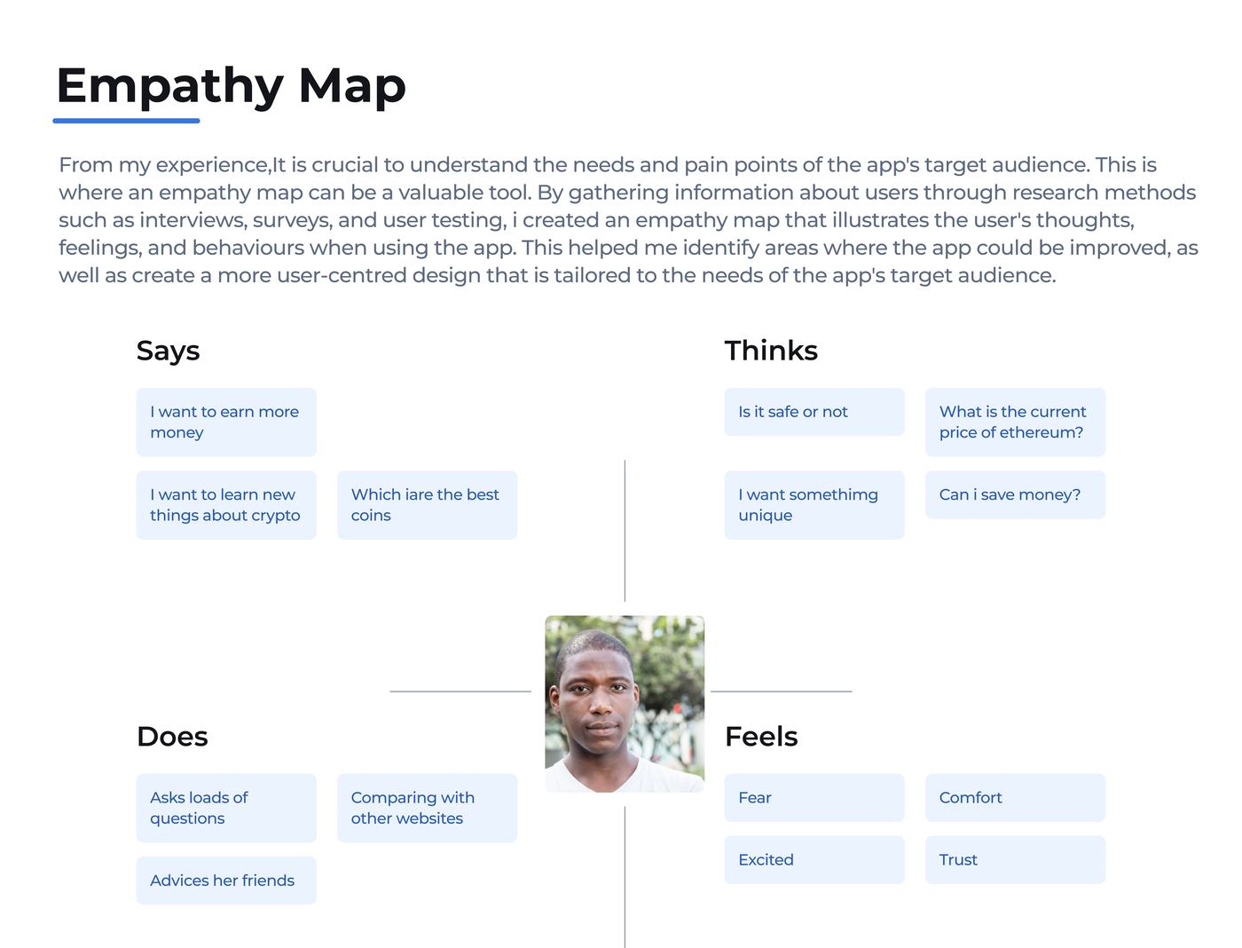
Mapping the emotional landscape around crypto, what users say versus what they quietly feel.

Crippy empathy map
07 · User journey

Walking in their shoes.

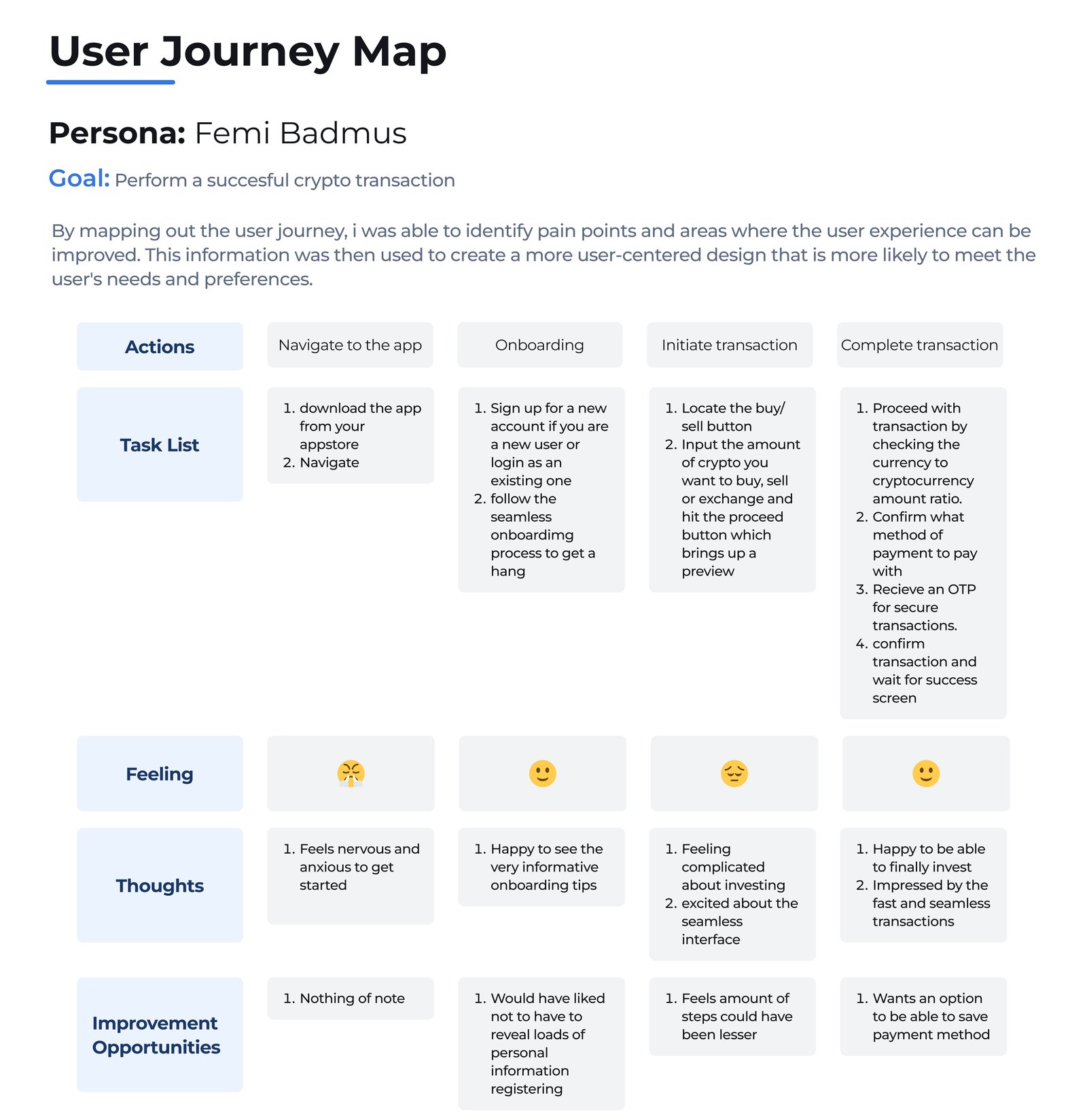
The end-to-end journey a user moves through, the stages, the actions, and the emotions at each step.

Crippy user journey
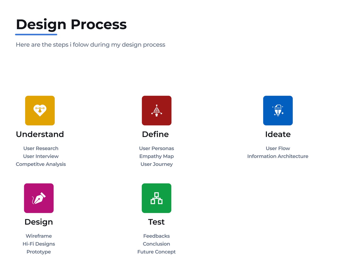
08 · Process

How it came together.

From research and architecture to low- and high-fidelity design, a structured path from insight to interface.

Crippy design process
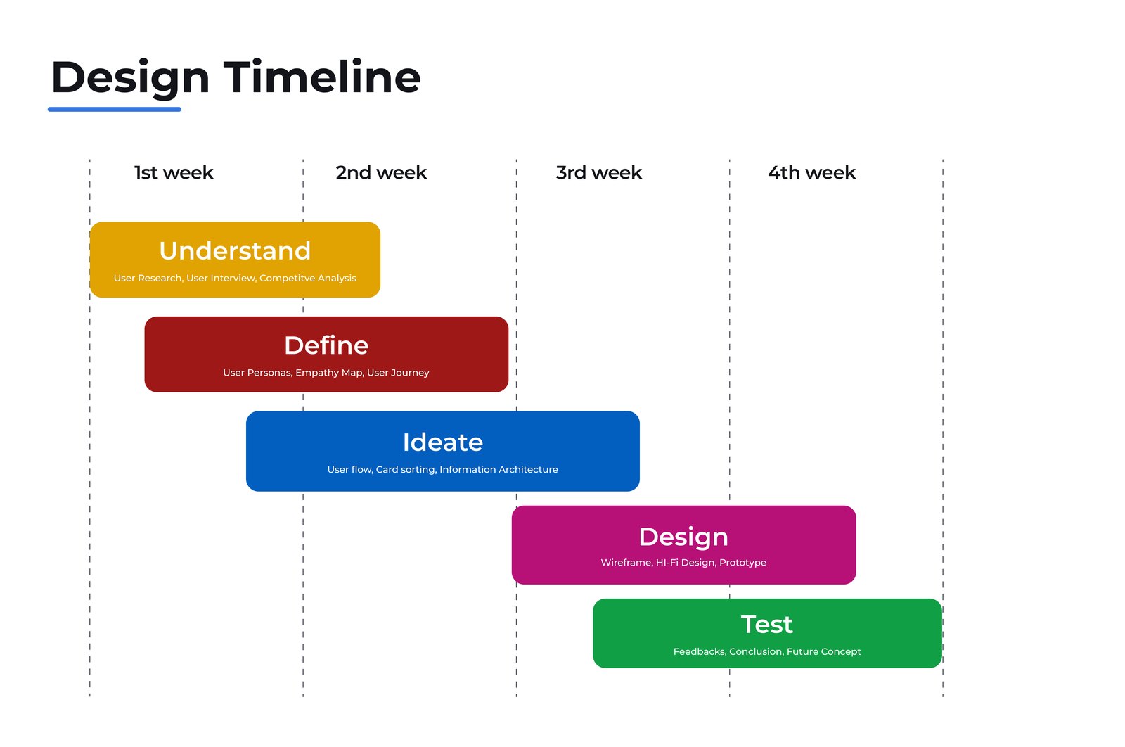
09 · Design timeline

The plan, on a schedule.

Phasing the work from research through delivery, what got done, and when, to keep a complex build on track.

Crippy design timeline
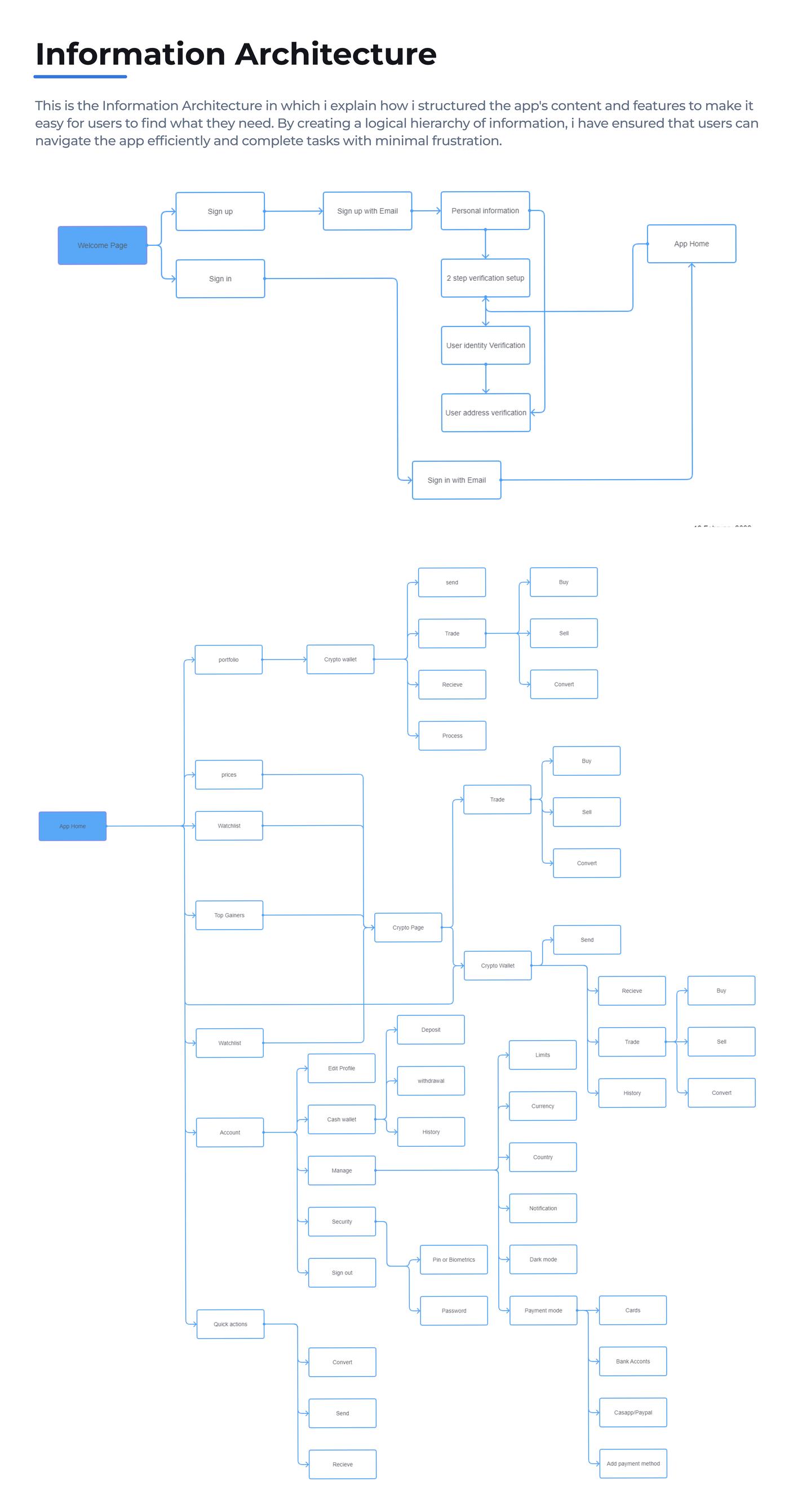
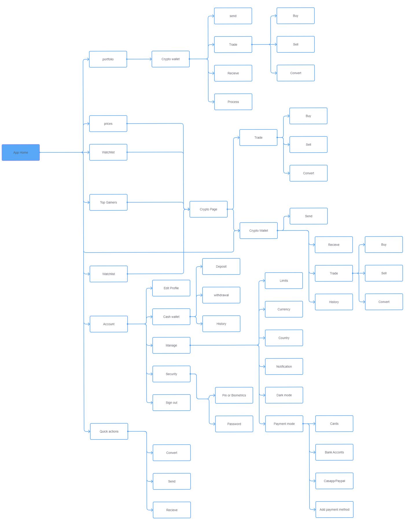
10 · Information architecture

Structuring the app.

Organising every screen and action into a hierarchy that newcomers could navigate without a manual.

Crippy information architecture

↕ Scroll inside the frame to explore the full IA

11 · User flow

The new-user journey.

Mapping the path a brand-new user takes, from first open to first confident transaction.

Crippy new user flow

↕ Scroll inside the frame to follow the full flow

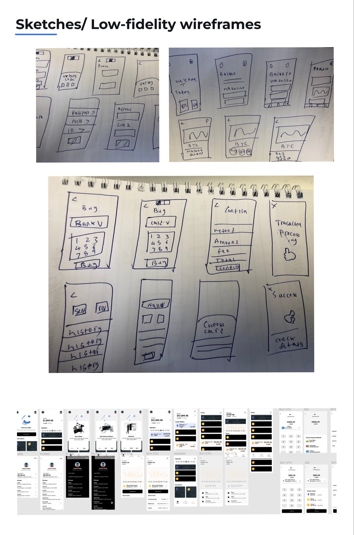
12 · Low-fidelity

Getting the bones right.

Wireframing the core screens first, proving the structure before a single colour went down.

Crippy low-fidelity wireframes

↕ Scroll inside the frame to see the wireframes

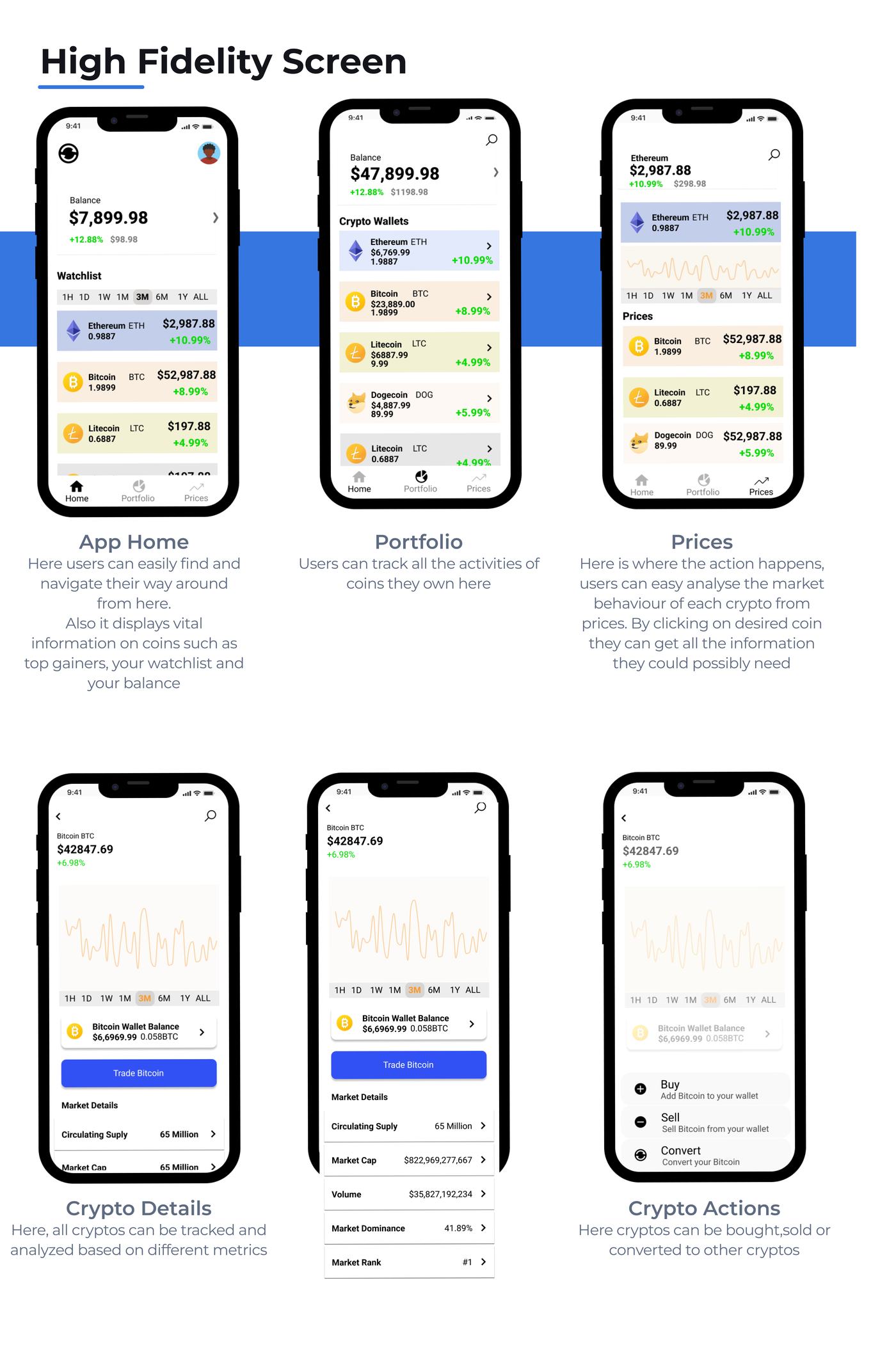
13 · High-fidelity

The finished interface.

Simple, elegant, performant, the watchlist, portfolio, payment, and trading screens brought to life.

Crippy high-fidelity screens
Crippy, more high-fidelity screens

↕ Scroll inside the frame for the full screen set

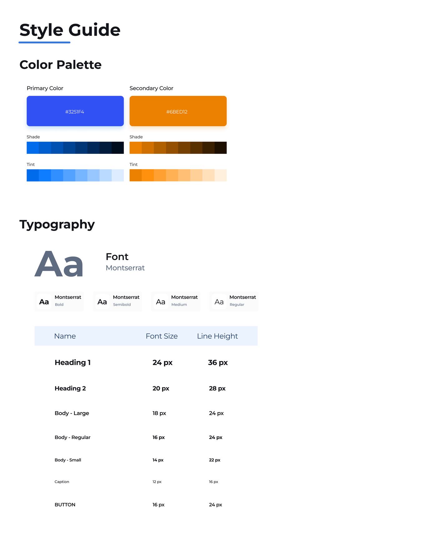
14 · Style guide

The system behind it.

Colour, type, components, and the brand mark, the rules that keep Crippy feeling like one product.

Crippy style guide

↕ Scroll inside the frame to explore the system

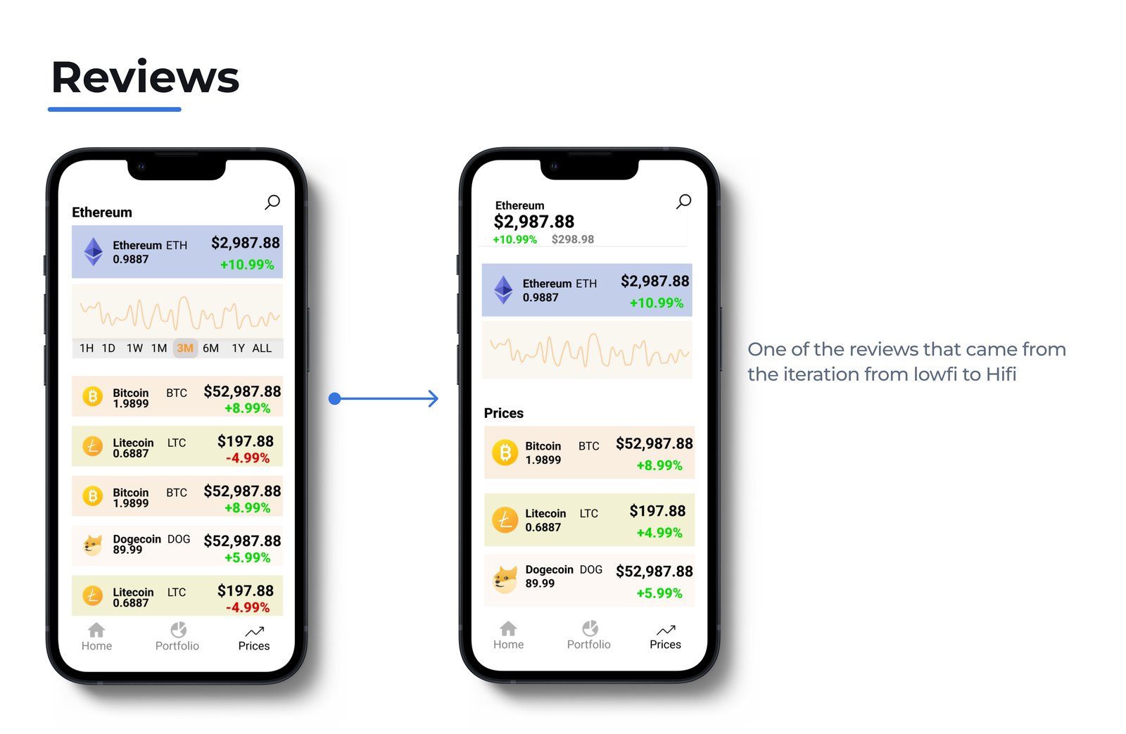
15 · Reviews

What people said.

Feedback gathered on the concept and the screens, the gut-check that the direction was landing.

Crippy reviews and feedback

Key takeaways

The biggest lesson: the first ideas have to be coherent and well-planned. A solid foundation saves an enormous amount of time later when you're making choices.

Crippy was the most challenging project I've taken on as a product designer, not easy, but exciting, and a genuinely good learning experience. It drove home that solid research is the foundation of everything: from typography to button size, each decision should be backed by insight.

16 · Future roadmap

Where Crippy goes next.

  • Thorough investigation and implementation of the specified features.
  • Improving the overall user experience.
  • More usability studies to validate that the pain points were effectively addressed.
  • Better error handling and clearer feedback.
  • More user research to find areas to improve.
  • Refining the navigation animation for a more sophisticated feel.
In one line

Crypto without the ambiguity, simple, elegant, and performant enough for a first-timer to trust on day one.

Read the full case study on Notion →