View
Back to archive Project · Events · Ticketing
Case study Mobile Brand Identity Research UI/UX

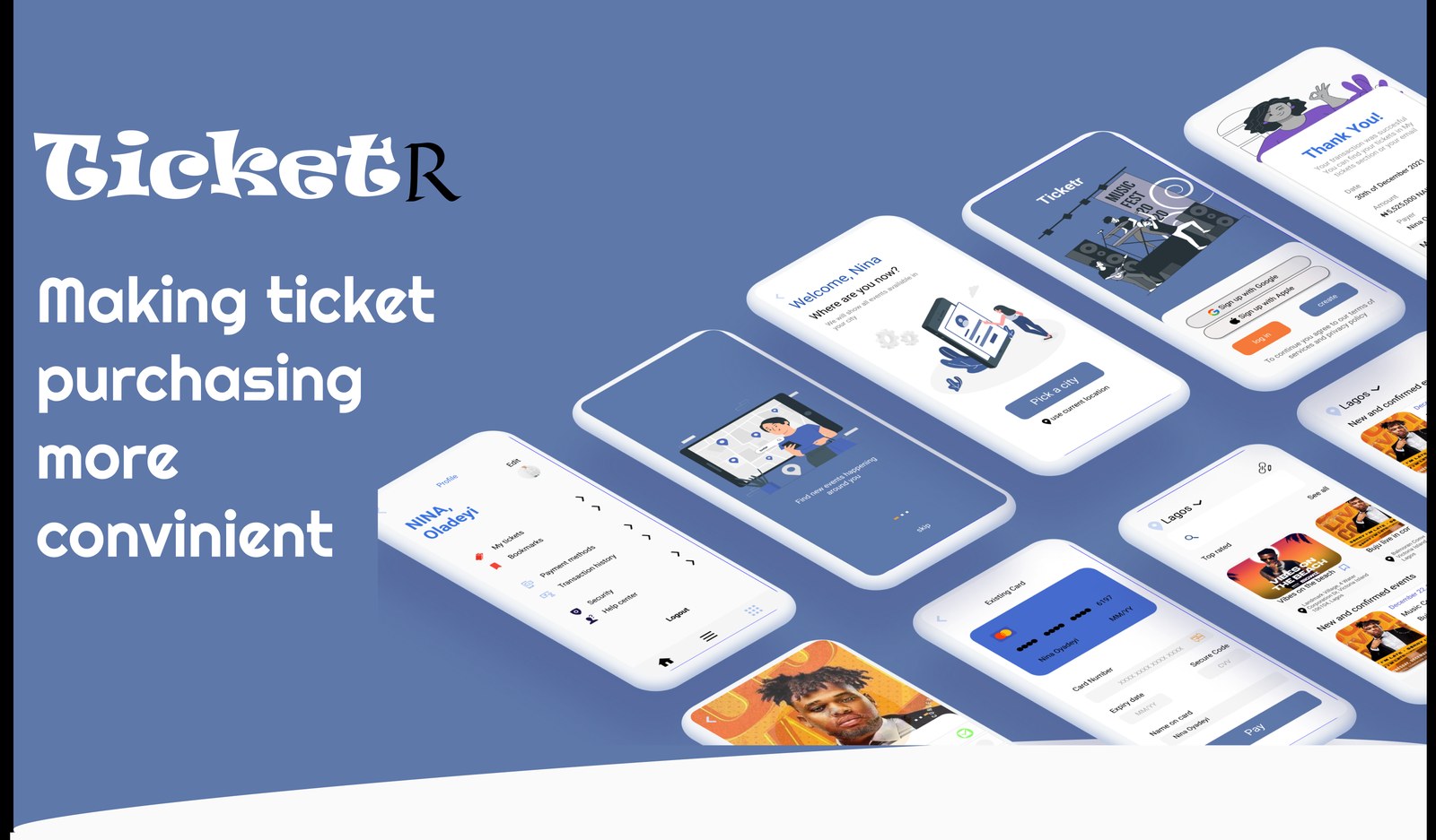
TicketR — making ticket purchasing more convenient.

A mobile ticketing app for buying tickets and tracking nearby events, every show you want, in one place, in your pocket. My first official project as a product designer.
RoleSolo · Research & UI/UX
Year2021
Timeline2 weeks
PlatformiOS · mobile
TicketR, mobile ticketing app screens
Prefer the deep dive? This page is a quick walkthrough, the full case study (research, process & every screen) lives on Notion.Read the full case study →

The idea

TicketR is a convenient service for quick ticket purchases, and for tracking events happening nearby. Instead of hopping between multiple ticket-surfing websites, everything is collected in one application. All in your pocket.

It was also a personal milestone: my first official project as a product designer, built solo over two weeks as a focused study in research and UI/UX.

01 · Problem & solution

Getting a ticket shouldn't be a chore.

From surfing multiple websites to wrestling with payments, buying a ticket was a hassle, so I put everything you need in a single app.

The problem

Getting tickets to events could be a hassle, surfing multiple websites, running into payment issues, and never being sure you'd found the best option. People needed one place that saves the time and the stress.

The solution, tickets on a single platform
  • Reduce the time spent searching across online ticket vendors.
  • A convenient service for quick, low-friction purchase.
  • Keep track of nearby events, all in one place.
02 · Process

From insight to interface.

A straightforward design-thinking path, empathise, define, ideate, design, and validate, kept a two-week build grounded in real user needs.

Research findings

UX research is the systematic analysis of users and their needs, offering context and insight to the design process. To find problems, establish facts, and reach conclusions, I leaned on a mix of methods and tools, feeding real data back into every stage of the work.

User research, 6 face-to-face interviews

To understand prospective users, I ran quantitative, in-person interviews with six people, asking open-ended questions like:

  • How often do you attend social events?
  • How difficult is finding tickets for your favourite shows?
  • Have you missed shows because of the hassle of getting tickets?
  • How would you feel about being notified of new and upcoming events?
03 · Key findings

What the research said.

100%had missed out on shows due to the hassle of getting tickets
90%would like to be notified about upcoming shows they'd be interested in
70%attend shows and events often
80%find it difficult getting tickets for their favourite shows
04 · Personas

Who we're designing for.

Two event-lovers who'd both rather be at the show than fighting to get in.

Tumi Abdul

36 · PR Manager

Education: Bachelor of Science  ·  Location: Lagos

A PR manager for a top music record label and a fan of every kind of event. He doesn't enjoy the hassle of calling or surfing the web to buy tickets, the stress has discouraged him from attending as many shows as he'd like.

Frustrations
  • Hates surfing the web for tickets
  • Dislikes the extra charges
  • Rarely has time to stay updated on shows
Goals
  • Convenient payment & quick service
  • A stress-free experience
  • Constant info on upcoming events

"Honest to stan, an incredible concert is all you need to be truly happy."

Ogechukwu Mba

28 · Content Writer

Education: Masters  ·  Location: Abuja

A content writer who works remotely for non-Nigerian clients. She hates the stress of finding out where and when her favourite events are happening, and has missed out on shows because of her busy schedule.

Frustrations
  • Hates not being in control
  • Doesn't enjoy being charged extra
  • So busy she forgets her favourite events
Goals
  • Convenience & quick service
  • A stress-free experience
  • Reminders on the things that matter

"Success is based on pure hard work, there's no such thing as luck. Or is there?"

05 · Empathy, structure & system

Mapping it out.

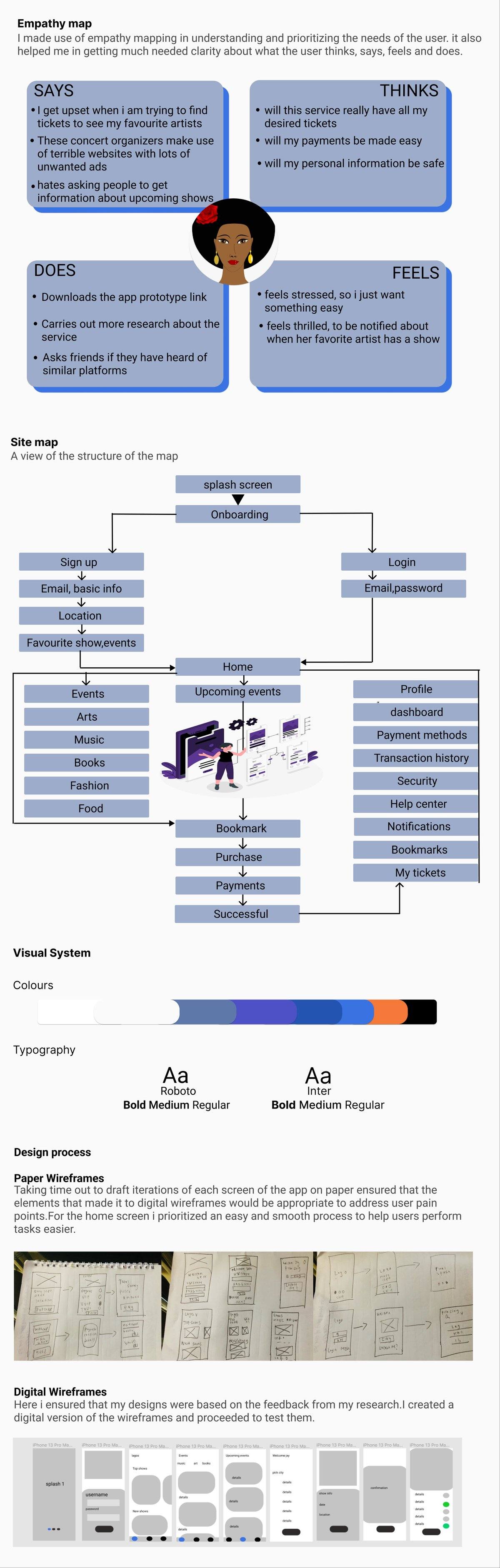
An empathy map to feel the user's world, a site map to structure the app, and the visual system, colour and type, that holds it together, down to the paper and digital wireframes.

TicketR empathy map, site map, visual system and wireframes

↕ Scroll inside the frame, empathy map · site map · colours & type · wireframes

06 · Final designs, getting in

Simple, informative onboarding.

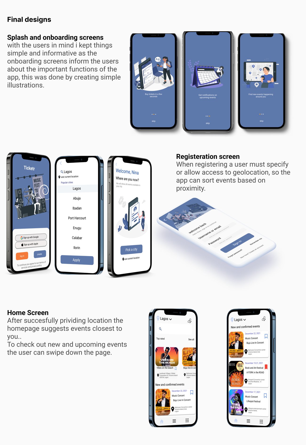
Splash and onboarding screens that explain the app's key functions through simple illustrations; a registration step that asks for location so the app can sort events by proximity; and a home screen that surfaces what's closest to you.

TicketR splash, onboarding, registration and home screens

↕ Scroll inside the frame, splash · onboarding · registration · home

07 · Final designs, buy & manage

Find it, buy it, keep it.

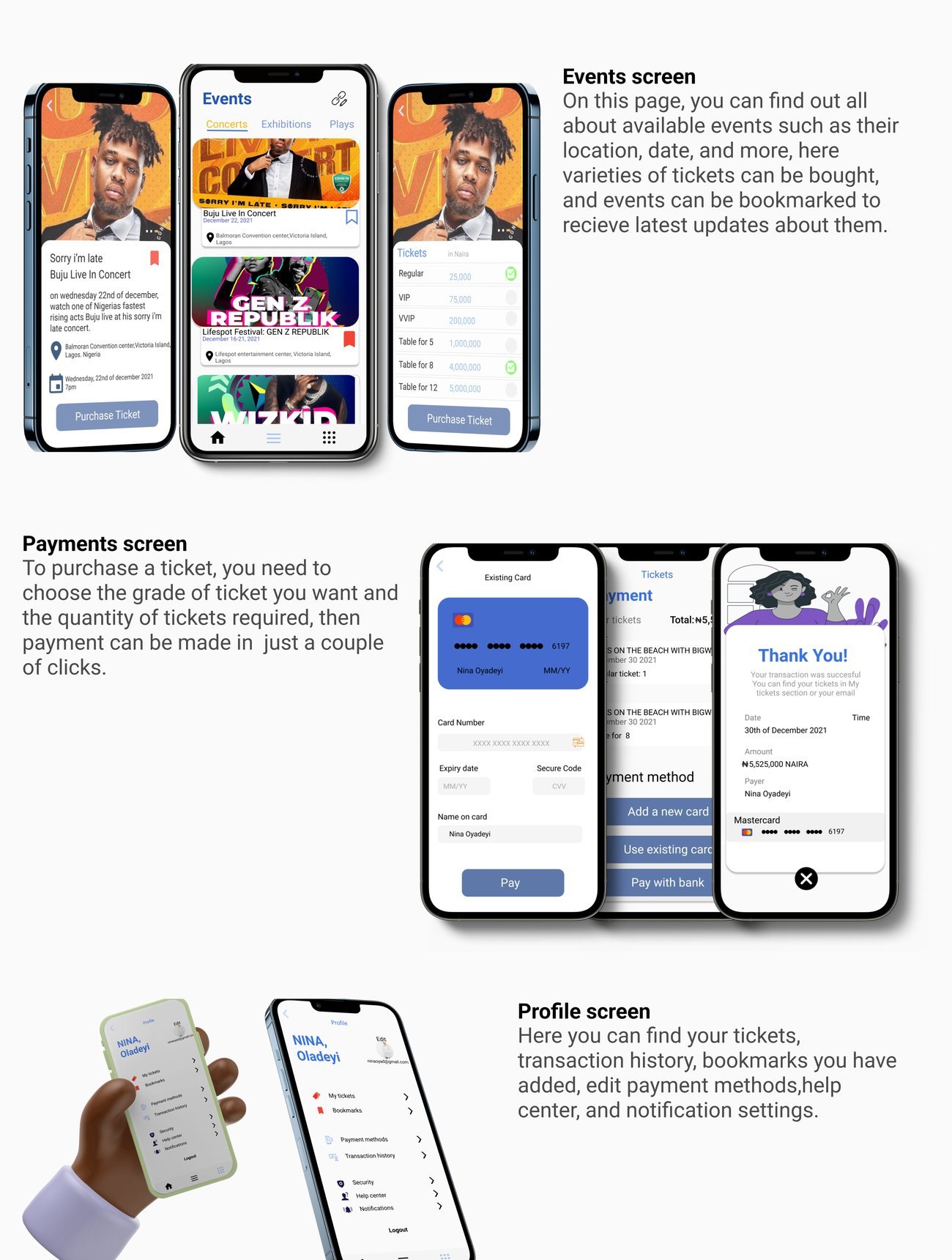
An events page with location, date, ticket varieties, and bookmarks; a payment flow that takes a couple of clicks; and a profile that holds tickets, transaction history, bookmarks, payment methods, and notifications.

TicketR events, payments and profile screens

↕ Scroll inside the frame, events · payments · profile

My experience

Working on TicketR gave me hands-on experience across the engaging stages of UX design. Solid research always forms the foundation, without it, things don't work well together. Each design decision, from typography to button size, has to be backed by insight.

As my first official project as a product designer, it wasn't always easy, but it was exciting, and a genuinely good learning experience. Next step: more user research to find new areas of need.

In one line

Every show you want, in one app, in your pocket, no more surfing five sites to get through the door.

Read the full case study on Notion →