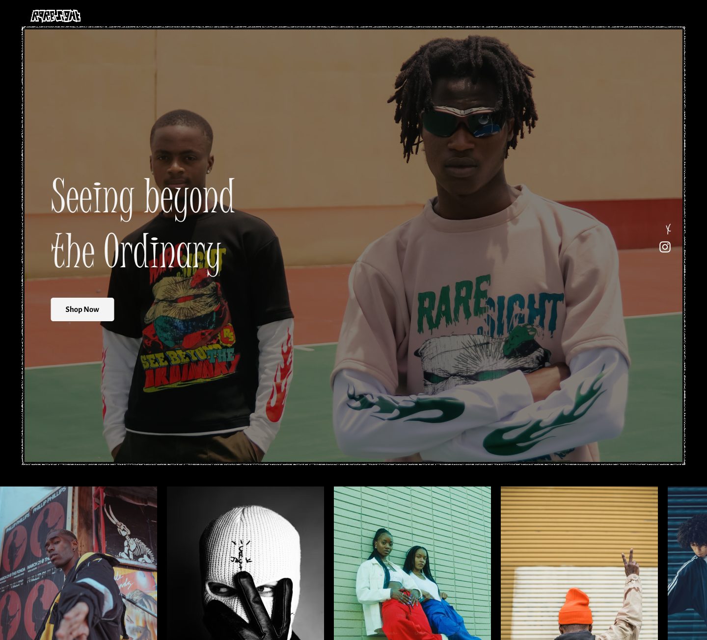
A statement-driven fashion brand brought online, as bold, edgy, and versatile as the label itself, designed to showcase the latest drops and connect with every kind of customer, from "Calm" to "Savage".
When a friend conceptualised RareSight, a unique, statement-driven fashion brand, I knew I wanted in immediately. It was exactly the kind of brand that deserves a website with attitude.
I teamed up with fellow designer @AK, and together we built a fashion experience with a single mantra: see beyond the ordinary.
A site as bold, edgy, and versatile as the brand itself, able to spotlight the latest styles while connecting with wildly different customer vibes.
Whether you walk in feeling "Calm," "Savage," or somewhere in between, RareSight should feel like it was made for your mood that day.
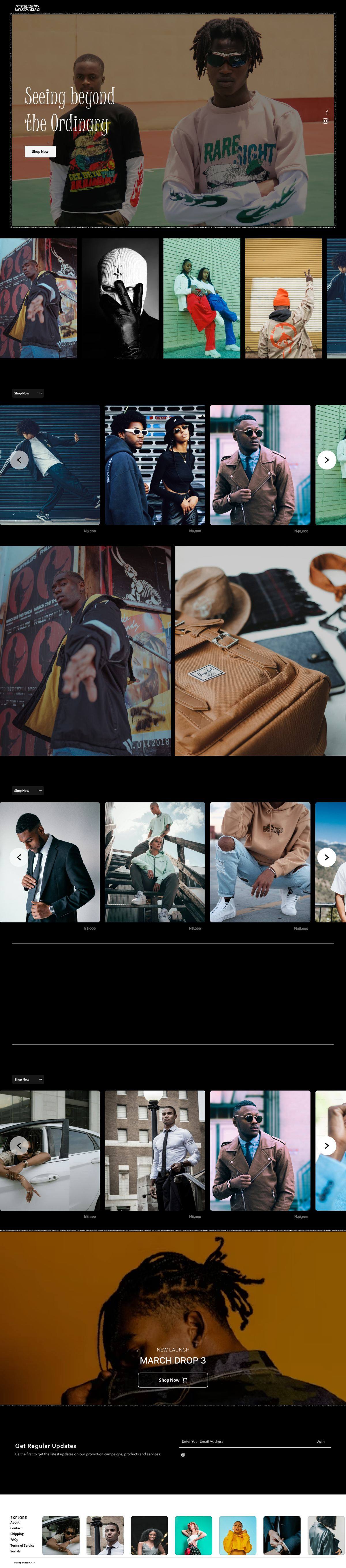
A spotlight on what's trending, dedicated sections for New Arrivals, Best Sellers, and the unique monthly drops the brand lives on.
Bold colour and confident art direction paired with navigation that stays smooth, a stylish shopping experience that never gets in its own way.
Fashion philosophy from icons like Oscar de la Renta threaded through the pages, adding personality and a little soul to the scroll.
Designed to feel seamless on phones, tablets, and desktops, so browsing flexes to wherever the customer is.
From the "Seeing beyond the Ordinary" hero down through the lookbook grids, the de la Renta moment, and the latest drop, scroll the whole thing.

↕ Scroll inside the frame to explore the full homepage
Bold visuals are only half of it, the feel is in the motion. Here's the site moving.
RareSight, landing page interaction · 0:16
The collaboration drove home how much bold design depends on usability to actually work. Striking is easy; striking and effortless is the hard part.
Testing layouts and iterating on real feedback is what revealed the equilibrium, attention-grabbing aesthetics that still get out of the customer's way.
The design is complete, one backend build away from going live. Stay tuned for the drip drop.