View
Back to archive Project · PropTech
Concept Mobile UX & Visual Design Logo

RentEasy — finding a home, as easy as scrolling.

A sleek, renter-meets-homeowner app designed to make the rental process feel as easy as scrolling your favourite social feed, one experience that serves owners listing their places and renters eager to browse them.
RoleProduct & Visual Design
Year2023
PlatformiOS · mobile
ScopeUX · UI · logo · prototyping
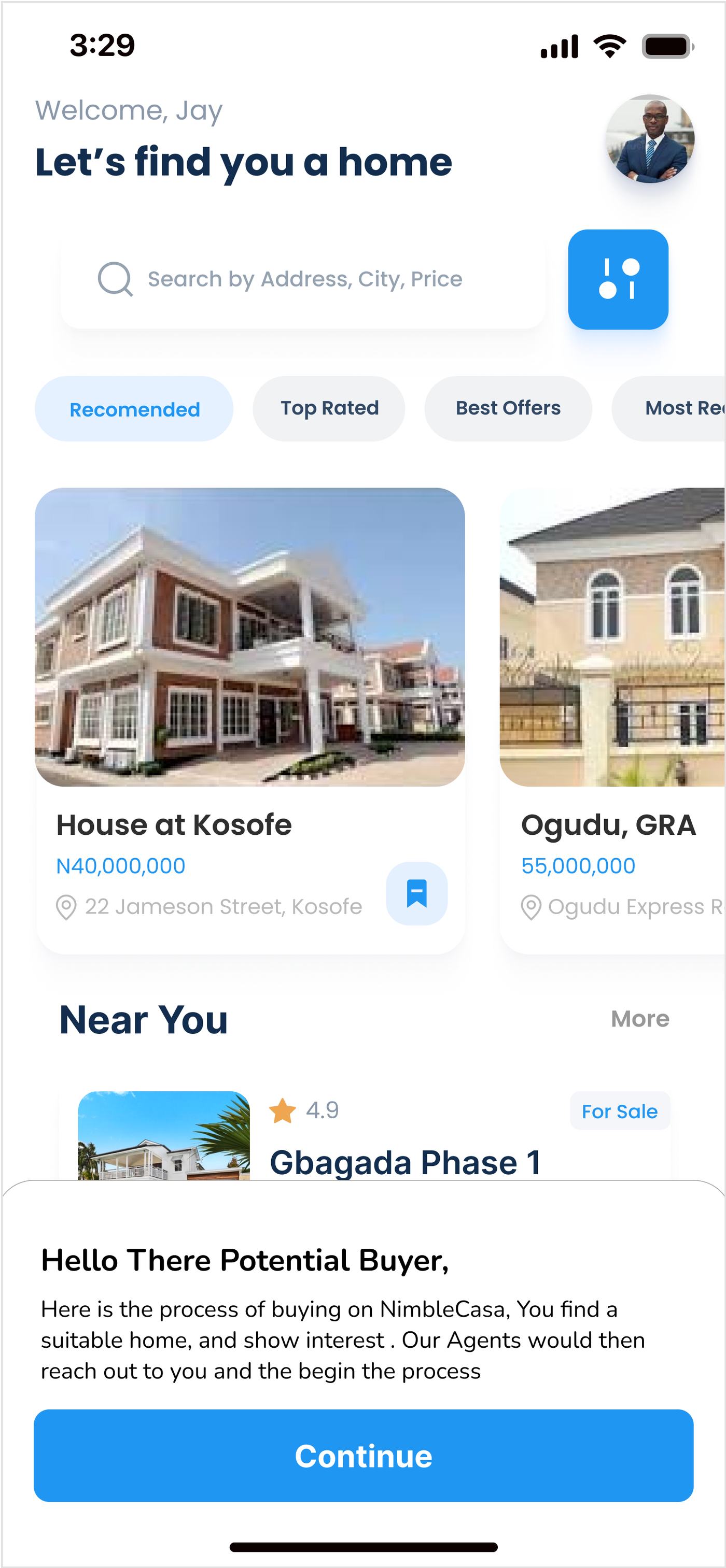
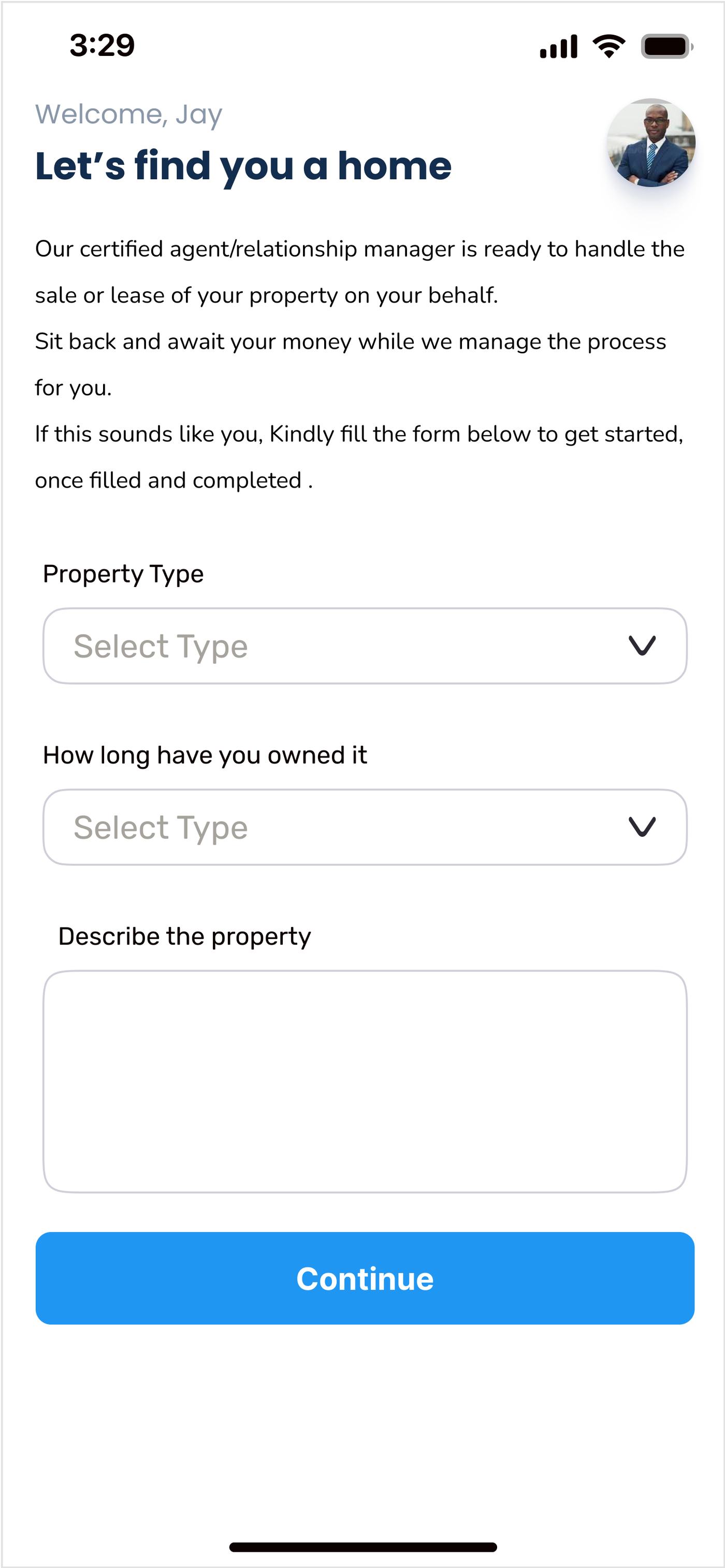
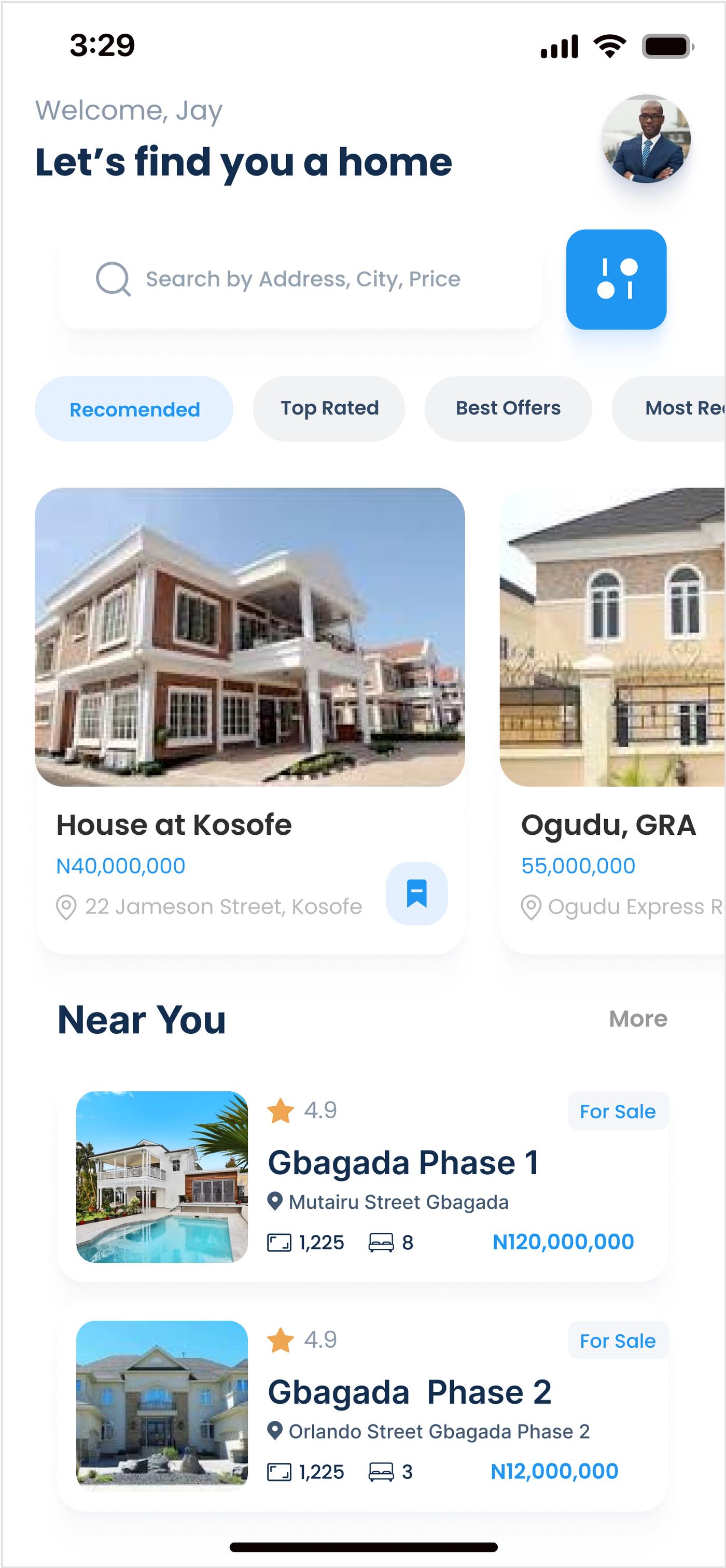
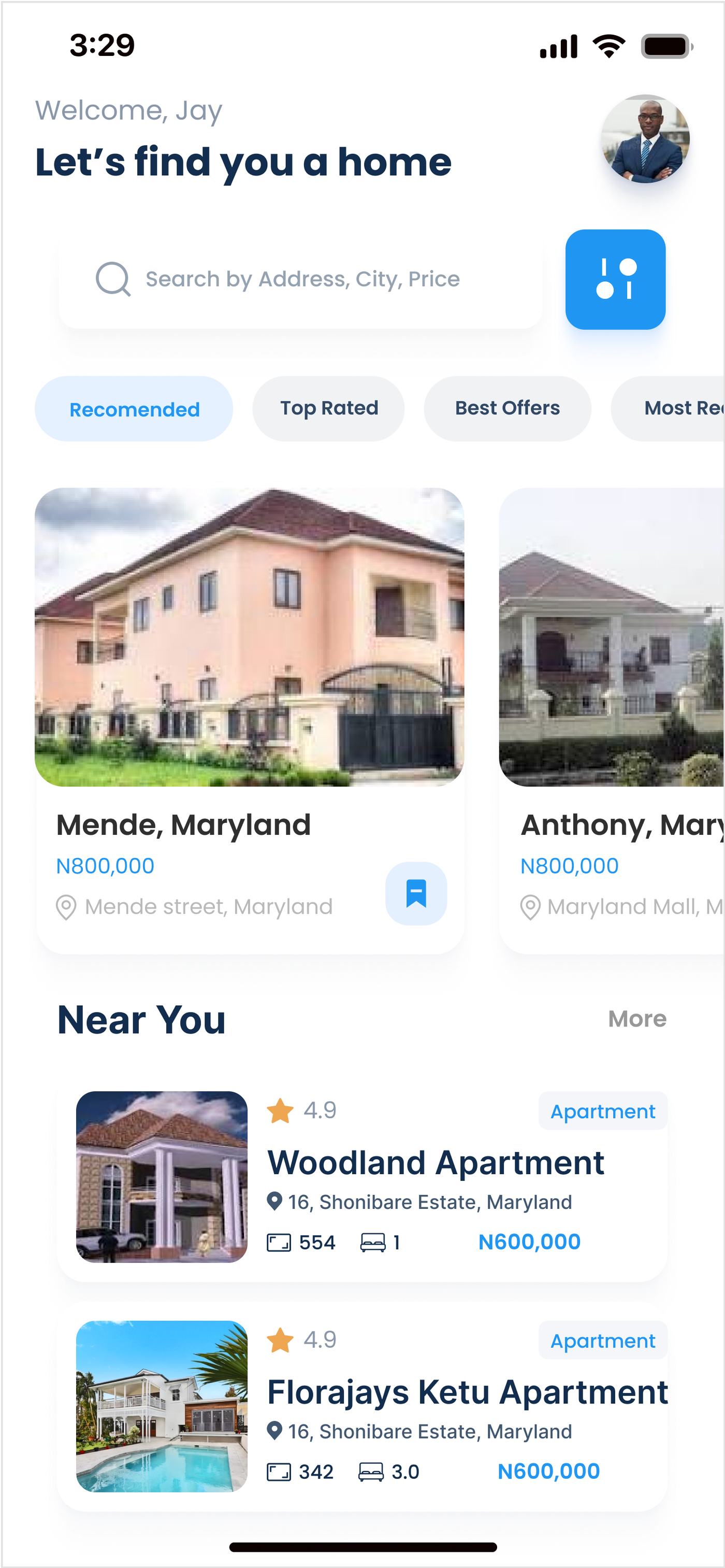
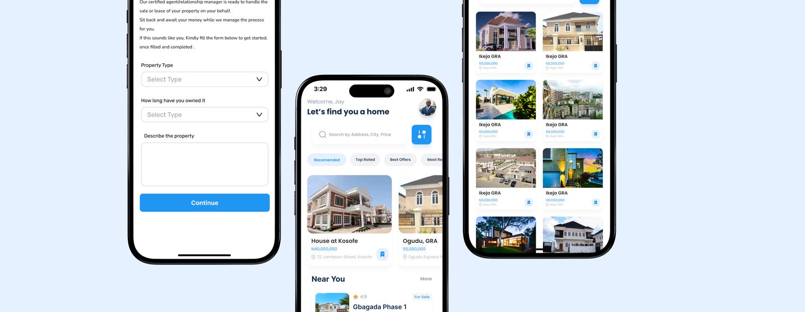
RentEasy, seller listing form, buyer home feed, and property grid

A concept, pitched in an interview.

RentEasy started as an interview pitch, a chance to put together a concept that captured the needs of both homeowners looking to list their properties and renters eager to browse them.
The interview didn't end in an offer. But the idea was too good to leave behind: a sleek, renter-meets-homeowner app that makes the rental process as easy as scrolling through a social feed, and it became some of the work I'm most happy to show.

My role

I handled the full scope, from wireframing and prototyping to crafting a streamlined onboarding that felt genuinely welcoming.

All of it inside real constraints: limited screens and a tight timeline. As a multidisciplinary designer I also created the brand and logo, so the product felt like one coherent thing end to end.

The challenge

Simplify the rental search so completely that anyone, from tech pros to total novices, could navigate it with ease.

The bar was simplicity without skimping on functionality: easy enough for a first-timer, capable enough to actually list, browse, and manage real properties.

01 · Onboarding

A friendly intro, not an interrogation.

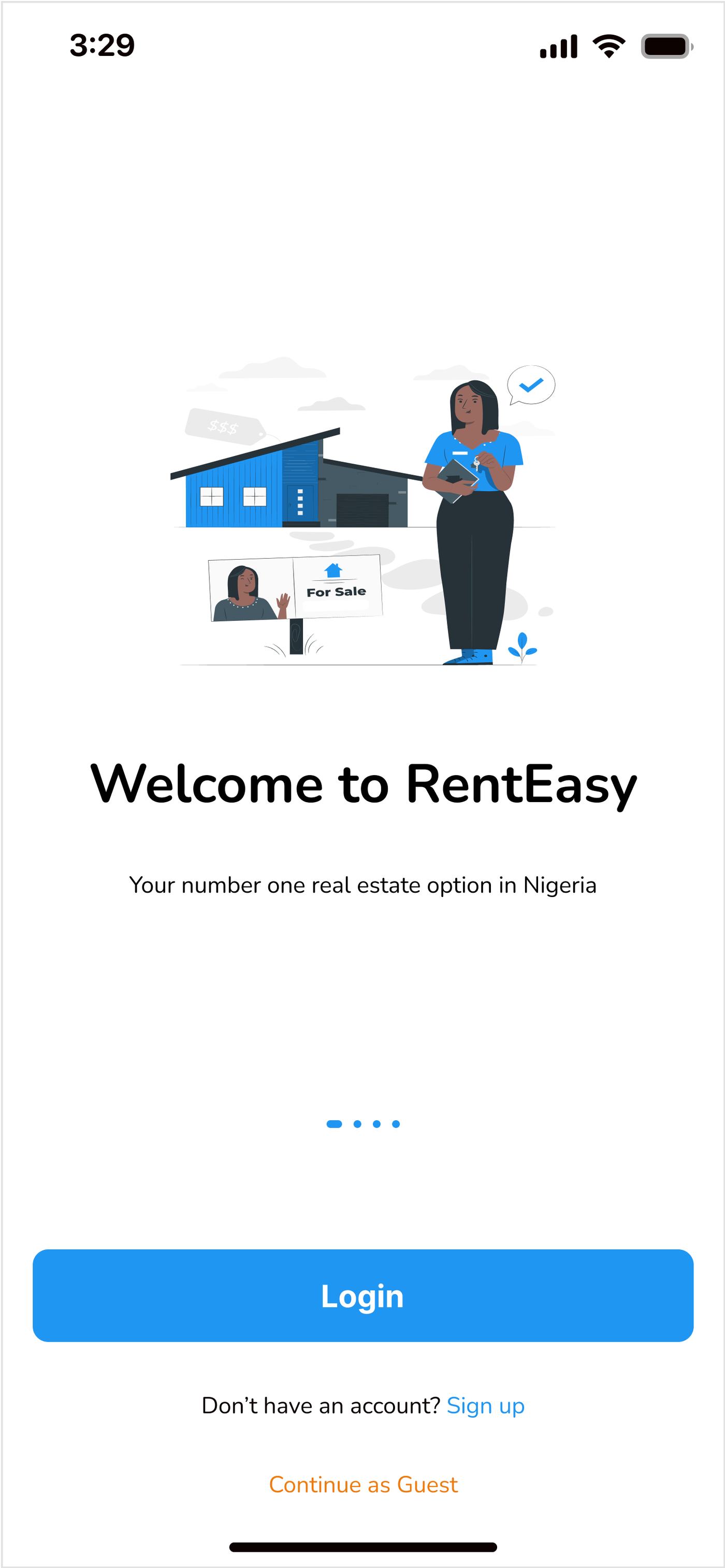
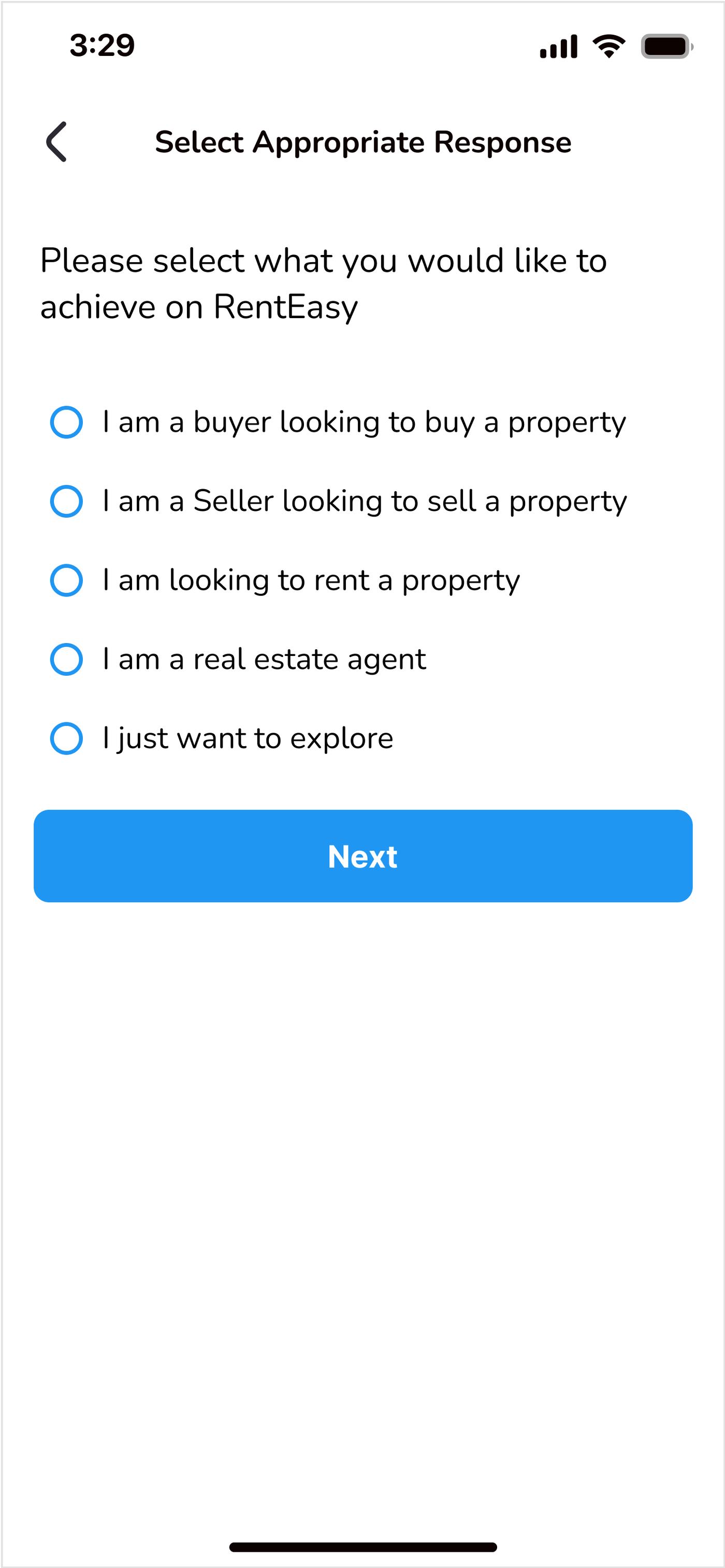
A simple, no-fuss guide through setting up preferences, so renters only ever see what suits their needs, and everyone picks the path that fits them.

RentEasy onboarding slider
RentEasy choose account type
02 · Three ways in

One app, three points of view.

Buyers, renters, and sellers each get a welcome and a home base tuned to what they came to do.

RentEasy buyer welcome
Buyer

Ready to find a place

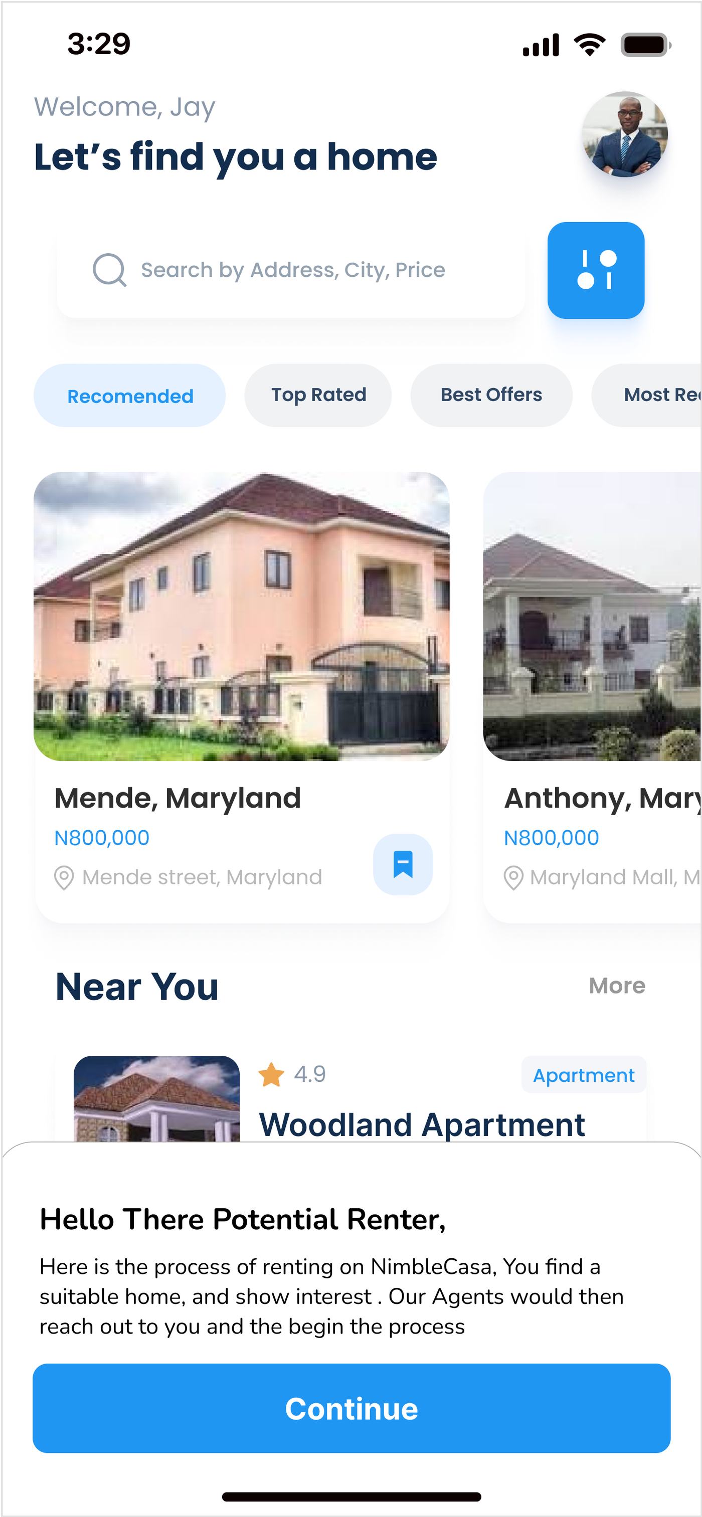
A warm welcome straight into discovery, "let's find you a home."

RentEasy renter welcome
Renter

Browsing made effortless

Set preferences once, then see only what actually fits.

RentEasy seller experience
Seller / owner

List faster than a coffee

Simple, straightforward steps to put a property up with minimal forms.

03 · The experience

Clean visuals, intuitive filters, easy swiping.

Browsing built to feel like a breeze, smart filters narrow the field, and a clean home feed makes the right place easy to find.

RentEasy buyer browsing experience
RentEasy renter browsing experience
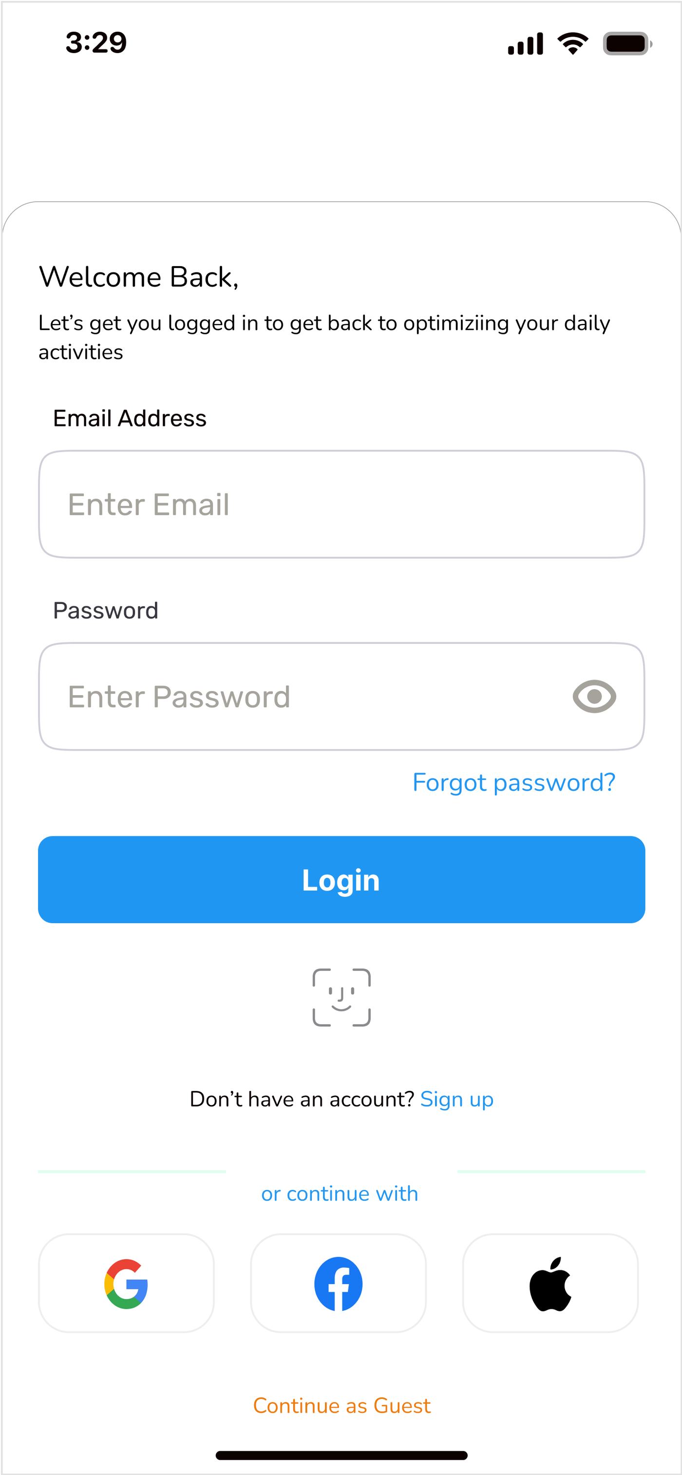
RentEasy sign in
04 · See it in action

RentEasy, in motion.

A quick run through the flow, onboarding, choosing your path, and browsing the right way.

RentEasy, walkthrough · 1:04

Outcomes & lessons

No offer, but a concept I was proud to walk away with, and one of the more useful things in my portfolio since.

More than that, it gave me hands-on insight into user-centred design for real estate: designing for very different users (owners and renters) inside one calm, simple experience.

05 · What's next

RentEasy 2.0.

If I revisit it, here's where it goes next.

01

Virtual tours

Walk a property from the couch, before ever booking a viewing.

02

Personalised recommendations

Listings that learn your taste and surface the right places sooner.

03

In-app chat

Connect renters directly with owners, without leaving the app.

In one line

Two very different people, an owner and a renter, meeting in one app that feels as easy as scrolling.