TelsCare is a multi-role telehealth and care-management platform connecting patients, providers, nurses, service organizations, and administrators in one coordinated care ecosystem. As Product Design Lead, I shaped the UX strategy, role-based workflows, design system, core product screens, and public website from the ground up.
I led all product design for a five-role telehealth platform: core workflows, dashboards, patient management, and the design system underneath it. Design team of two, I owned the core product end to end. Everything below is real, delivered screens. Skim the images, they tell the story.
Design one healthcare platform for many different users, without making the experience feel fragmented or overwhelming.
Led product design across web, mobile, admin tools, provider workflows, patient experiences, the design system, and the public website.
10+ role-based experiences and 500+ screens on one scalable design system, AI-assisted care through Hikmah, and testing that showed faster nurse documentation and better admin visibility.
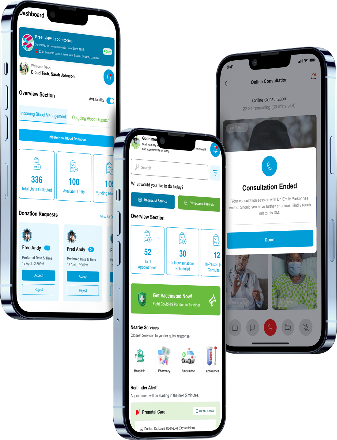
TelsCare wasn't a single app, it was a connected platform spanning hospitals, clinics, ambulance teams, pharmacies, labs, nurses, doctors, care workers, patients, and administrators, each with different goals, permissions, and comfort with technology.
So the challenge was never "design the screens." It was to give complex healthcare work a structure that felt coordinated.
With more than ten user types, the biggest UX risk was fragmentation. If every role got a completely different experience, the platform would become expensive to build, hard to maintain, and confusing to scale.
But if every role shared the same interface, people would be dragged through irrelevant actions and admin-heavy screens that had nothing to do with their job.
How do we build one connected healthcare platform where every user sees only what they need, while the system stays consistent underneath?
With this many roles in one product, every screen decision needed one consistent test to pass. These three became that test.
Each user sees the workflows, information, and actions relevant to their role, and nothing that isn't.
Critical tasks, documentation, referrals, care updates, are designed to be completed quickly, under real pressure.
The interface should feel like care support, not admin software. Calm states, plain language, no friction theatre.
Before designing a single screen, I mapped each role to what they actually need, the job, the workflows, the information that matters, the device they're on, and what breaks if the design gets it wrong.
| Role | Primary job | Key workflows | Critical information | Device | Risk if poorly designed |
|---|---|---|---|---|---|
| Patients | Manage their own care | Book appointments, video consults, view records, message providers | Appointments, prescriptions, health history | Mobile | Confusion, missed care, low trust |
| Nurses | Complete assigned care tasks | Wound-care documentation, notes, photo uploads, task review | Assigned tasks, patient status, due times | Mobile | Missed updates, incomplete records |
| Doctors | Diagnose and direct care | Consults, prescriptions, referrals, record review | Patient history, labs, current status | Web + mobile | Wrong context, slow decisions |
| Pharmacists | Dispense & manage medication | Prescription queue, verification, refills | Prescriptions, dosages, patient flags | Web | Medication errors |
| Lab technicians | Process & report tests | Test requests, results upload, status | Pending tests, priorities | Web | Delayed or lost results |
| Ambulance providers | Respond & transport | Dispatch, status updates, handoff | Location, urgency, patient basics | Mobile | Slow response, lost handoff |
| Care workers | Coordinate day-to-day care | Referrals, task assignment, follow-ups | Referral status, patient needs | Mobile + web | Care falling through gaps |
| Admins | Monitor operations | Dashboards, overdue tasks, referrals, staff management | Operational signals, exceptions | Web | Low visibility, delayed intervention |
| Org managers | Oversee performance | Analytics, staffing, compliance | Throughput, outcomes, capacity | Web | Blind spots at scale |
| Service orgs | Receive & fulfil referrals | Accept referrals, manage capacity, report back | Incoming referrals, status | Web | Broken coordination, no audit trail |
Not every screen carries equal weight. Three moments decided whether the platform actually worked in the field.
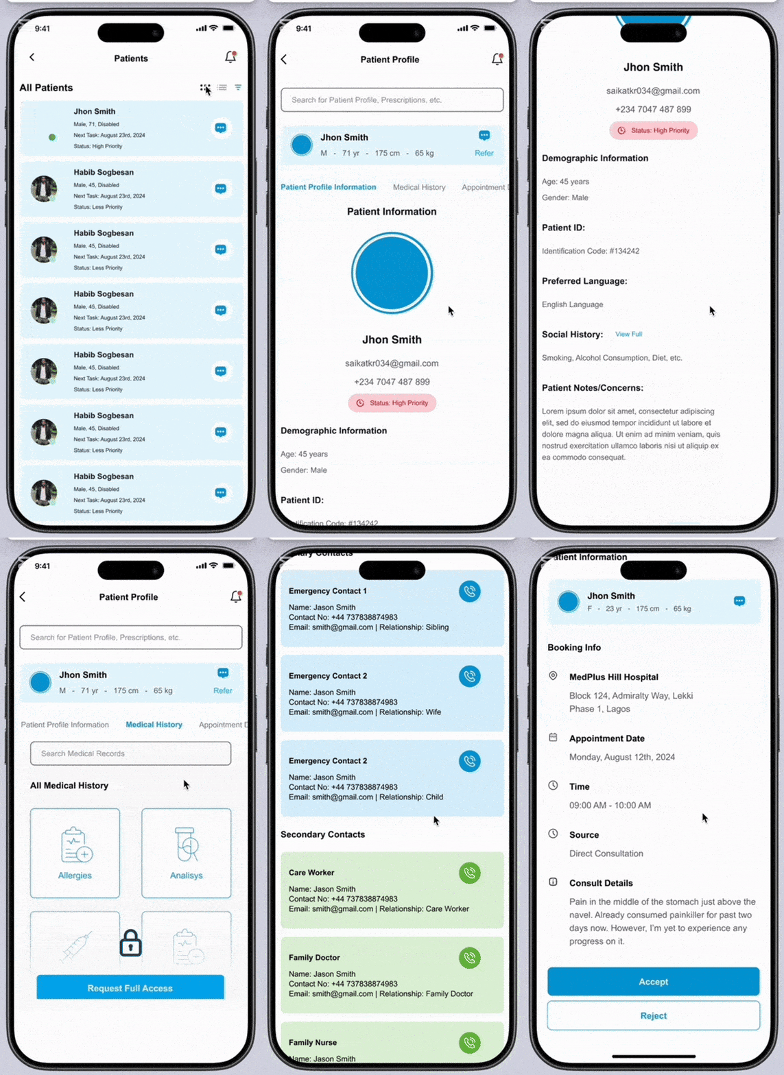
Nurses were holding care together with fragmented tools, spreadsheets, photos sent over WhatsApp, verbal handovers. The fix wasn't a prettier form; it was a single mobile-first task-completion flow built for the bedside.
In internal testing, nurses documented care faster with fewer errors and cleaner records, around 60% faster documentation in test sessions.
Proves, mobile workflow design · healthcare UX · frontline empathy
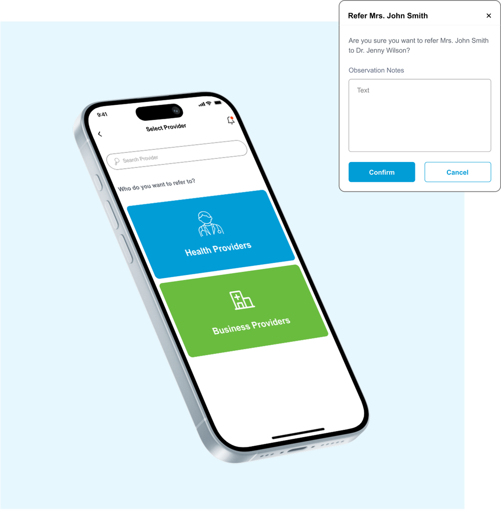
Referrals used to vanish, care workers and patients had no idea where things stood. I designed a three-step referral system with a provider directory and status visibility, so a handoff becomes a trackable chain instead of a guess.
Providers could see exactly where patients were being sent, and admins gained a clean audit trail of every handoff.
Proves, service coordination · operational visibility · trust through status
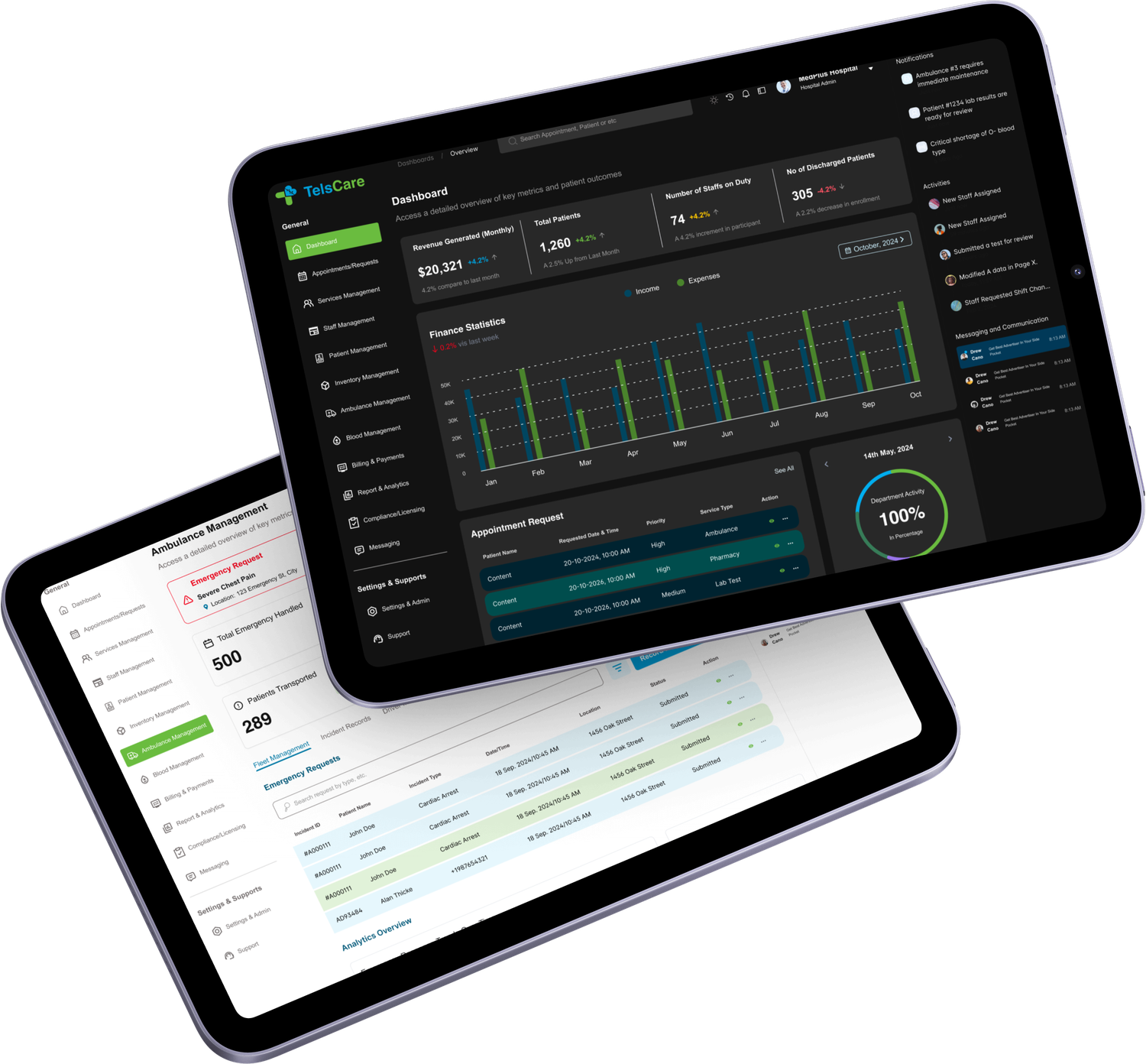
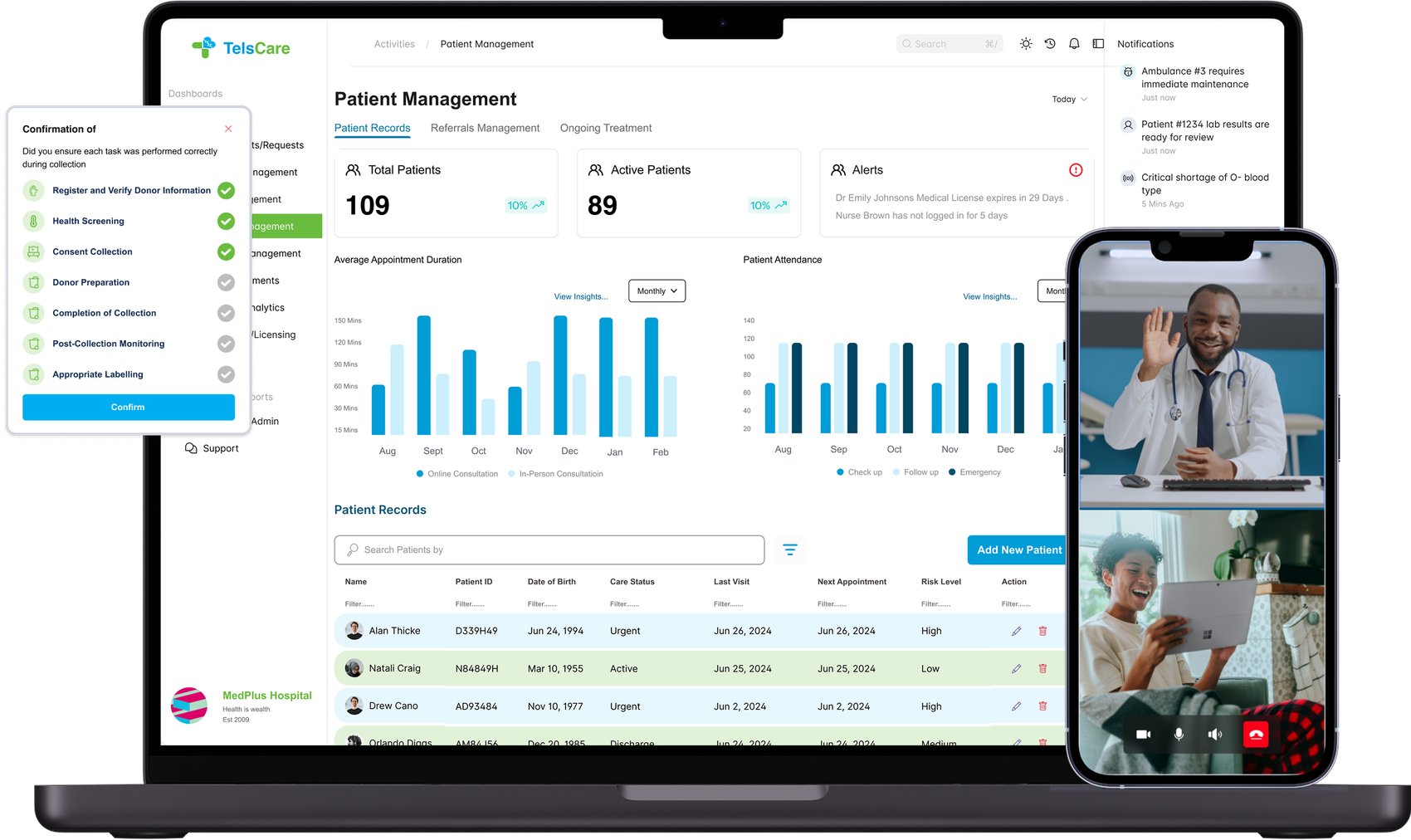
Admins had to track overdue tasks, referrals, staff, providers, and analytics, without drowning. So I prioritised the most urgent operational signals first and made the drill-down paths obvious, treating the dashboard like a control room.
Internal testing suggested admins could resolve issues faster than the legacy workflow, around 40% faster in those sessions.
Proves, data-heavy UX · dashboard prioritisation · decision support
As the platform grew, a pattern showed up: users didn't only need more screens, they needed help knowing what to do next.
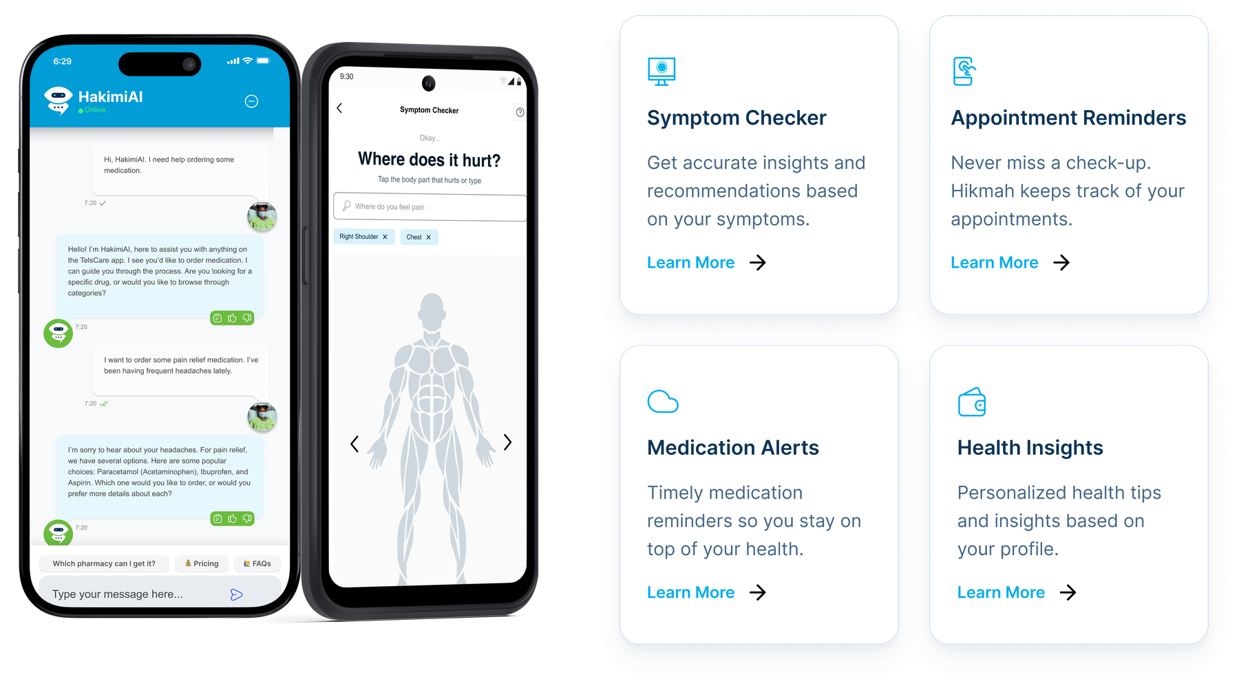
Hikmah was designed as an embedded AI assistant across patient and provider experiences. Its job was to support triage, task reminders, care instructions, referral guidance, and contextual nudges, without pulling anyone out of their workflow.

Healthcare is time-sensitive, repetitive, and emotionally demanding. The cost of "what do I do now?" is measured in care, not clicks.
Hikmah appeared inside patient and provider workflows with contextual prompts, reminders, and guidance, present where the decision happens.
AI should reduce uncertainty, not create more work. Every suggestion had to earn its place by removing a step.
To keep the product consistent across web, mobile, patient, provider, and admin experiences, I built a Material 3–inspired design system from scratch, tokens, components, states, and handoff specs.
The design system wasn't just for visual consistency. It gave the team a shared language for building across many roles without redesigning every workflow from zero.


Tokenised colour · spacing · radius · status pills · modals · alerts · dropdowns · form patterns · dark/light · Figma annotations · developer handoff specs
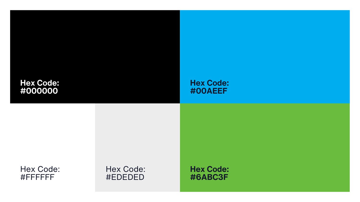
Alongside the product, I led the design of TelsCare.com, professional for clinics, trustworthy for patients, approachable for partners. I shaped the brand colour system, layout, copy tone, creative direction, and lead-generation flow.

Testing results are from internal sessions, not public-market numbers, labelled as such.
TelsCare taught me that healthcare design isn't about reducing clicks. It's about reducing uncertainty for people working under pressure.
It's where I learned to lead through ambiguity, building one system for many users, alongside engineering and operations, where trust, clarity, and speed all matter at once.
You're not just designing apps. You're designing relief.